Vince Clarke has a unique and consistent sound, but the ways in which his recorded body of work has been visually represented varies wildly. His releases have been packaged by a wide range of creative talents, and here we give a little respect to some of the highlights… By Andrew Dineley
From the beginning, visually interpreting Vince Clarke’s compositions has proved a challenge for any designer or photographer. Many have risen magnificently to the occasion, and the results have been as disparate as they are imaginative – and some are as visually inscrutable as the man’s early lyrical content. Take Dreaming Of Me, Vince’s first single as one quarter of Depeche Mode in 1981; for this Mark Crick, a school friend of Martin Gore’s, was drafted in. His ambiguous hand-drawn illustration of four diminishing figures with their backs to the viewer went uncredited, but its creator would go on to garner acclaim as an author and photographer in his own right.
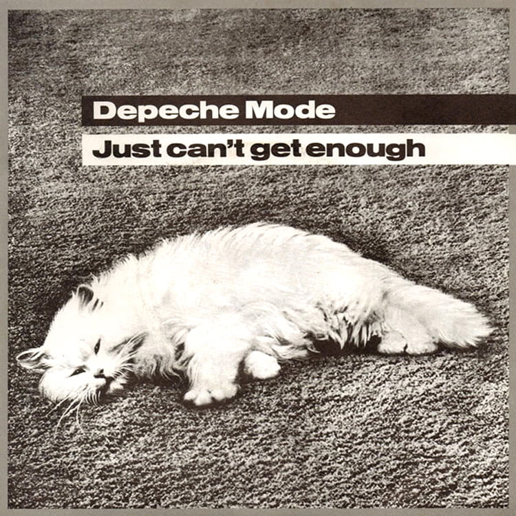
For their third single, Depeche Mode turned to Neville Brody, who would go on to take over design responsibilities for The Face, the magazine that helped define the graphic aesthetic of the 1980s. For Just Can’t Get Enough, Brody’s design – particularly in its 12” format, with its grainy, manipulated cover depicting a bound and blindfolded figure – was more confrontational than the pop tune it packaged. The 7” sleeve, in contrast, featured a fluffy white cat appropriated from a vintage advert for Kosset carpets. “The song and its sleeve were at odds with each other,” explained Brody. “The modular images portray exploitation and social bondage.”
New situation
When Vince Clarke found a singing partner to build Yazoo, Alison Moyet brought more than just a soulful vocal style – her keen interest in art also saw her sketching preliminary ideas for the design of the duo’s Don’t Go, along with ideas for a rudimentary logo that never got beyond the sketch pad. She would eventually get to flex her creative muscles and technical aptitude more fully on the cover of their fourth single in 1982, The Other Side Of Love, which featured one of her marbled, cut-up oil/paint collages on its sleeve.
Yazoo’s Nobody’s Diary single release featured another painting, this time the work of up-and-coming illustrator Steven Appleby. Today, he remembers the commission well: “I was given very detailed instructions about what had to be in the drawing – the trendy guy in the bath, the yellow duck, the bath overflowing,” he says. “The instructions came from Yazoo themselves – either Alison, or maybe Vince… possibly both. I was at the Royal College of Art at the time and shared a student house in Kensal Green with my friend, Ben Murphy, so he sat in the bath – probably empty of water – and I drew him directly in ink, then added the water colour.”
Yazoo’s 1982 debut album Upstairs At Eric’s featured an image of mannequins artfully arranged and photographed by Joe Lyons. The story goes that the disconnected bodies were pure chance; the seated dummies were pulled out from their table to set up the shot and the ideal image was serendipitously born.
The shoot took place at the photographer’s studio in North London. “I’d just shot some furniture for a furniture designer, and got paid with the furniture!” recalls Lyons. “I chose dummies, and started work… a fortuitous series of events. I felt the hi-tech furniture worked really well with the rough look of the room, and I put the cake – actually the top of my wedding cake – as a focus on the table.”
For You And Me Both in 1983, design duo Twenty-Three Envelope were tasked with creating what would be Yazoo’s swansong release, and they didn’t disappoint. At this point, Vaughan Oliver and Nigel Grierson were better known for their peerless visual stewardship of artists on the 4AD record label, founded in 1980. “I like to elevate the banal through surrealism,” Vaughan Oliver explained. “Mystery and ambiguity are important weapons in a designer’s arsenal.”
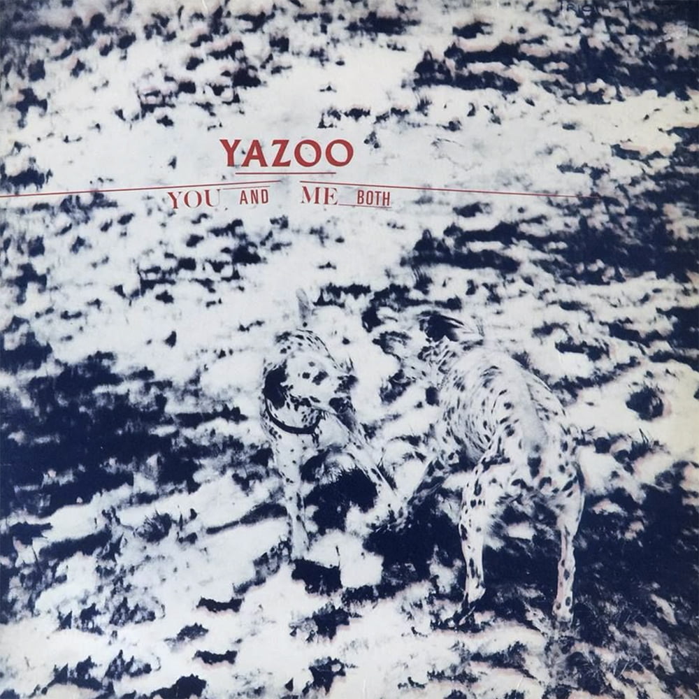
For Yazoo, the story goes that Moyet met with Grierson to look at some of his photos with a view to finding the perfect image. When she saw the shot of two dogs fighting, she immediately exclaimed “We’ll have that!” and the artwork was created from there. The confrontational cover wrapped up a period of recording that had been less than harmonious for both parties.
Dallies in wonderland
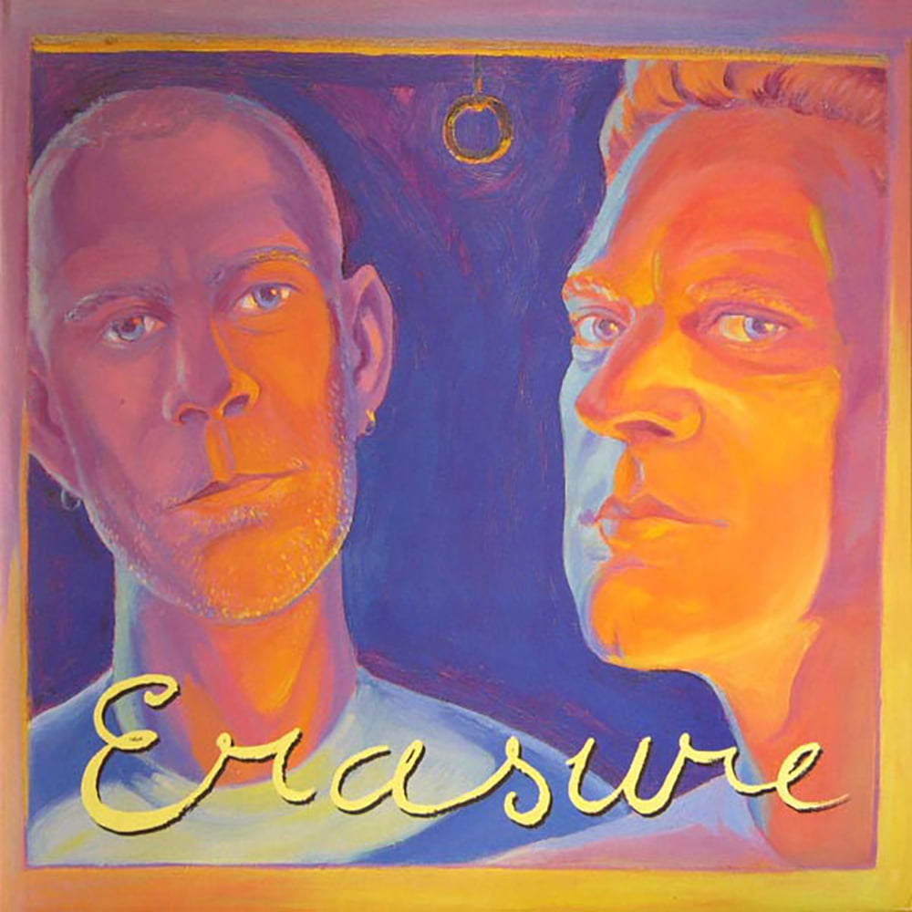
In 1986 Erasure released their debut album and a clutch of singles that set a high visual standard. Employing a consistent layout, the album and its three 7” satellites featured various couplings including cherubs, trains, toy soldiers and ballerinas (the keen-eyed may have noticed some clever cross-referencing, with – for instance – the soldiers silhouetted in the bottom corner of the front cover, and also used as background shadows in Monica Curtin’s inside sleeve photograph). “We were doing the photos for the album in an attic, and we came across some old books, one of which had the story of the tin soldier in it, so we used it for the single,” explains Andy Bell. “It sort of fitted in with the idea of fairytales, which is in the album.”
The original sleeve art for Oh L’Amour featured illustrations of Percy and Rheneas, train characters from Rev W Awdry’s Thomas The Tank Engine, the famous series of children’s stories dating back to 1946. They worked well with the vintage aesthetic that informed much of Erasure’s approach during this era, but the sleeve was abruptly withdrawn due to licensing complications to be replaced with a simplified typographical variant.
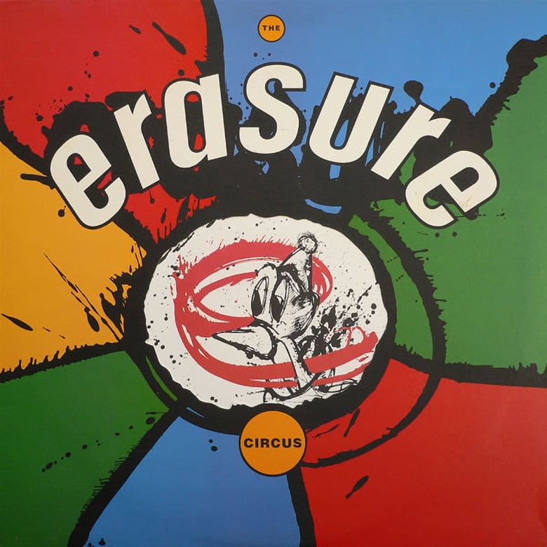
These sleeves were all created by Health & Efficiency, an early nomenclature for Paul White, who would continue to work with Erasure using his own name for the sleeve of Sometimes in 1986 before founding Me Company for a run of work that continued with The Circus and its hyper-coloured splashy single sleeves – It Doesn’t Have To Be, Victim Of Love and finally The Circus, which was made available as a limited edition three-record set, with each cover featuring its own circus animal.
The sleeve for The Innocents featured a French stained glass window depicting a scene of Emperor Charlemagne being visited in a dream by Saint James instructing him to wage a holy war, tying in nicely with some of the record’s theological themes. This, as with all the releases around this project, was the work of Paul Khera with Slim Smith. The first single was Ship Of Fools, and Paul remembers how it all came together. “I was totally into music at the time,” he recalls. “I rang up lots of labels, bands and design companies and visited Mute to show them my photos. They were really nice – they made time to look through the work and to listen to the ramblings of a student photographer!
“Initially they wanted the band to be in the sleeve somewhere, in a kind of textural way. I was really into found objects and story-telling. Everything was a found item in my mind, including the type; I just set about editing it together. I went to Brighton one cold winter day and picked up lots of shells and built a little set with the photos washed up on the beach… two lost explorers looking for a lost paradise. I knew there was a book of the same title, and we borrowed old typography from that.”
Chains Of Love followed a similar path, with starfish and pearls. ‘It’s all mixed up with sea life and bits of wreckage,” explains Paul. “Typographically, we borrowed from 60s soul singles – it really had that feeling to me at the time, even though it was electronic music.”
The sleeve of A Little Respect seemed to show an amphitheatre, seen from far above. “That one was built on locations around the world that our adventurers were searching for, how each place has its own mythology and architecture which reveals a piece of the puzzle,” Paul details. “A band writes songs about the ups and downs of life and how that inspires them, and I wanted to represent that in an abstract way.”
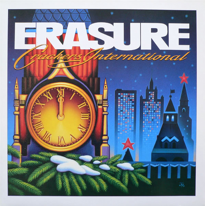
Between albums, at the end of 1988, Erasure released their festively-themed Crackers International EP. Its main sleeve and limited edition variant went once again under the creative direction of Paul White’s Me Company, but it was the work of fine artist James Marsh that dominated. Marsh may be more renowned for Talk Talk’s exquisite lepidopteran sleeve art, but for Erasure, more obscure examples from his portfolio provided inspiration. A 1977 celebratory New Year stamp from Russia informed the main sleeve design, while its limited edition partner came from a Pythonesque pastiche of Christmas originally created for an advertising agency in 1979, featuring a snowy idyll scattered with washing powder.
Two go wild
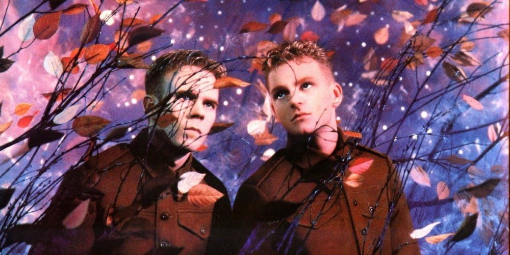
Vince Clarke and Andy became one of the first mainstream pop acts outside France to work with the acclaimed creative duo of Pierre et Gilles. However, the front cover of Wild! eschewed the sensuous portraiture for which Pierre et Gilles were renowned, and it was only inside the album that we got to see Erasure, photographed amid a wild storm of leaves, with every element meticulously positioned and glued into place. An explosive close-crop of leaves from this beautiful shot was featured on the front cover as a backdrop to graphics once again provided by Me Company. The theme of wilderness was explored further on the sleeves of the single Drama!, which featured floral images from other photos from the portfolio of Pierre et Gilles.
Into the 90s and Erasure shifted direction both sonically and visually for the release of Chorus. Siân Cook was working at Me Company at the time, and remembers how the designs came together: “We were experimenting with colour copy collages and I think the scales for the background of the Chorus single were scanned from a real fish!” she laughs. “The album concept was styled around pharmaceuticals and biotech – the repeated ‘e’ pattern and ‘10ml’ were inspired by medicine packaging, with stock photography that referenced big pharma promo brochures. Andy and Vince’s heads on the cover were composite images – Monica Curtin photographed their silhouettes and Vince and Andy had actual MRI scans done. The coloured areas inside the heads were colour photocopy collages, while the pink/purple auras around the outside of the heads were taken from images of Kirlian plant photography which were manipulated and wrapped around the silhouettes.”
With the release of their 1994 album I Say I Say I Say the duo took up virtual residence in several whimsical cartoon realms. The creative brief was directed by Assorted iMaGes, with character design by Norman Hathaway. “Mute were emphatic that the sleeves should be contemporary and appeal to current design trends, having a techno/3D aesthetic,” expands Hathaway. “Andy Bell wanted a Disneyesque illustration of a forest with he and Vince as cartoons and some sort of mystical event happening. The idea was to have an old-fashioned rendered background, with the cartoons in a flat 2D style.
“I got to work on the caricatures of Vince and Andy in a variety of situations and poses. Andy Bell was thrilled, but the record company were keen to emphasise the logo and minimise the cartoons. I shrank them three or four times before they were finally happy!”
In 1995 Erasure released their self-titled album, with its moody vibe reflected in the cover by Ashley Potter. “The main image was painted with acrylics on stretched canvas, about 1.5 metres tall,” recalls Potter. “I started with a range of pencil sketches and used tracing paper to move elements of the design around. After selecting the best compositions, I took those up to the next level of finish. I was given photos to work with plus waxwork heads, which I think were from Madame Tussaud’s. I also had references – Edward Hopper paintings, descriptive references of window frames. I used a reducing lens – a magnifying glass in reverse – so I could see what would happen once it was reduced to sleeve size. The singles Stay With Me and Fingers And Thumbs were a chance to explore other parts of my practice, like linocut, which I did using Japanese paper and a wooden spatula.”
Rob Ryan’s unique ‘paper cut’ art is instantly recognisable, and in 2005 he took on responsibility for illustrating the sleeve of Erasure’s 11th album Nightbird and its accompanying singles. The uniquely Ryanesque results fitted the brief nicely, subtly placing Vince and Andy before a glowing, photographic vista.
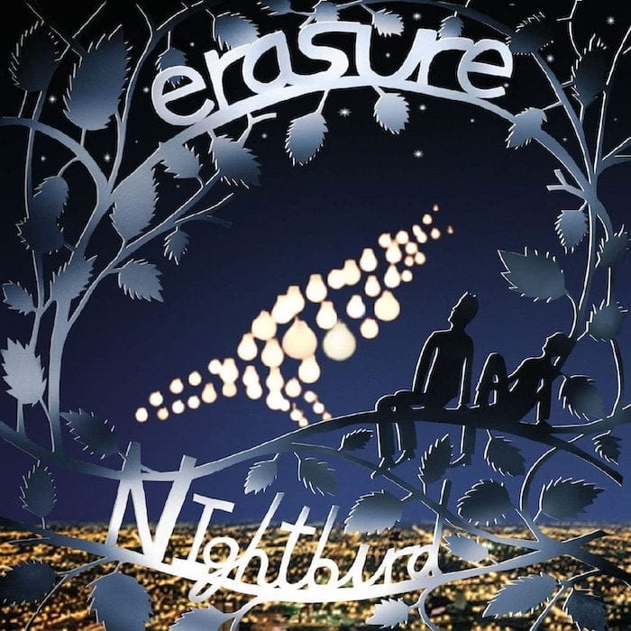
“I always think it’s best to keep things as simple and poetic as possible,” Ryan offers. “To feature the guys pictorially wasn’t a prerequisite, as far as I can remember, but I felt that somehow they themselves should be a part of the picture. We put in an immense amount of time creating the nightbird in real-sized lightbulbs in a big photo studio, using metres and metres of cable. Each light had its own dimmer switch – they loved us at the local electrics shop, we spent a fortune there!
“In retrospect this all seems a bit mad now and would probably be done in Photoshop today, but I wanted it to be a real bird made up of lights. I guess in a way it was my weird concession to the electronic music the band make, to somehow work hands-on with electricity myself.”
Painting the future
For 2011’s Tomorrow’s World project, Tom Hingston Studio worked with a selection of Kate MacDowell’s corporeal sculptures to create a stunning series of sleeve designs. “I thought the combination of surreal soft organic shapes, hearts and hands and brains, and the cotton candy colours were great for Erasure’s delicious pop,” reflects MacDowell. “My work is bare, white porcelain clay, so all the colours were added by the studio. They described using and tinting various different pieces I had already created, and that evolved into me giving them the source material for a lot of images in my portfolio and letting them cut them up and piece them together. I did create some new pieces – butterflies and mayflies/dragonflies – that were photographed locally in various positions so they could create insect swarms around certain images.” Vince, it turned out, was so enamoured with Kate MacDowell’s sculptures that he purchased some for his personal art collection.
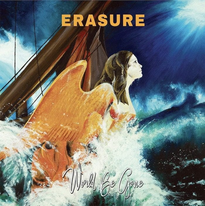
For the World Be Gone album, Louise Hendy led the duo back towards traditional painting. “Andy and Paul A Taylor, Mute’s art director, usually work together to develop Andy’s ideas,” says Hendy. “For this album the initial idea from Andy was ‘Jason and the Argonauts with a stormy black ink sea with a gorgeous ship’s figurehead, dunked but really proud!’ Paul pointed me towards Ray Harryhausen’s films and briefed me that it had to show optimism, as it was signifying the world coming through bad times towards a better future. I mocked up the images on my computer, drawing onto them, then painting them in acrylic on large canvases.”
Paul A Taylor’s artistic influence over the visual output of Mute stretches back three decades – he oversaw many of the releases referenced in this feature – but it was on Erasure’s latest album, The Neon, that he chose to take the lead, working this time as art director and chief designer. “Andy and Vince gave me the album title but no further info or ideas,” says Taylor. “That’s unusual for them, as Andy usually has the seed of an idea.
“I think it’s a strength that they are always open to do something new with their artwork, so I didn’t want to go where we’ve been before. I was in the cinema and after one particular scene the thought struck me that this isn’t just the name of the album, it’s a world, and it can be anywhere… and what I wanted to do suddenly took real focus. I went to Vince and Andy and told them that to me ‘The Neon’ is a place, but not a fixed place, it’s a place within the imagination, a place to escape to, it could be anywhere, and I wanted to convey that with the artwork and to get a neon sign made to photograph as gateways to The Neon. I’d seen some work with neon that Anna Bergfors had done. Her wife Edith Bergfors is a great photographer, so I suggested that the three of us should collaborate. We had two neon signs made from a logo idea by Anna, and then the three of us spent two long days lugging them around Southern Spain. We came back with what I felt was a campaign of breadth and dignity, and when we were taking the shot that ended up being the front cover shot, we looked at each other and said, ‘That’s the cover’.
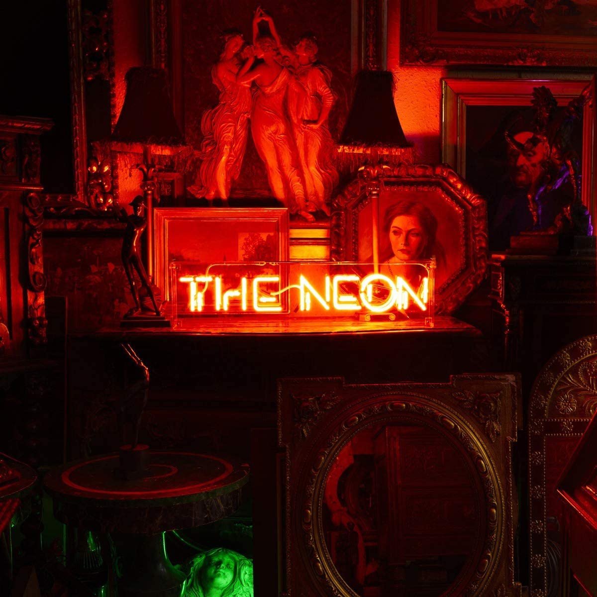
“I presented Vince, Andy and Daniel Miller with about eight options and they unanimously agreed on the one to use, which happily tied in with what we thought. Everything in the cover shot was placed and chosen specifically. I talked with Vince about having elements that told a story or referenced a song, lyric or piece of Erasure history in a subtle way.
“I think the front cover got the mood of the album right without hand-feeding the musical style of the album to people. To me it says, ‘This is not just an Erasure album, it’s a great Erasure album – aren’t you intrigued to hear it and come on a journey with them?’”
Indeed we are. It’s been a long journey, and long may it continue. We love you to the sky, Vince Clarke.
Classic Pop may earn commission from the links on this page, but we only feature products we think you will enjoy.