How the album art of 1985 reflected a time when design was a significant part of the pop package
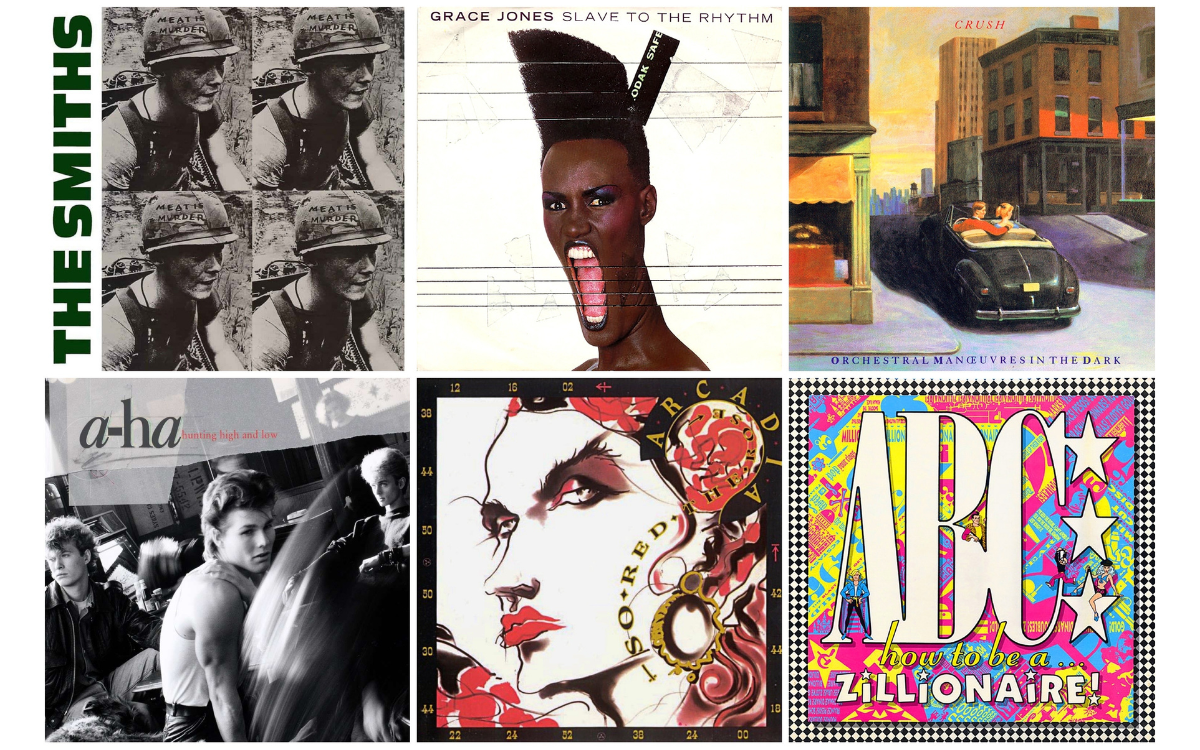
In 1985, many of the musical artists that we’d grown to love worked alongside the cream of creative talent to embrace varied concepts and techniques from the art world into their album’s sleeve designs. Here, we dive into a dozen of the year’s best.
By Andrew Dineley
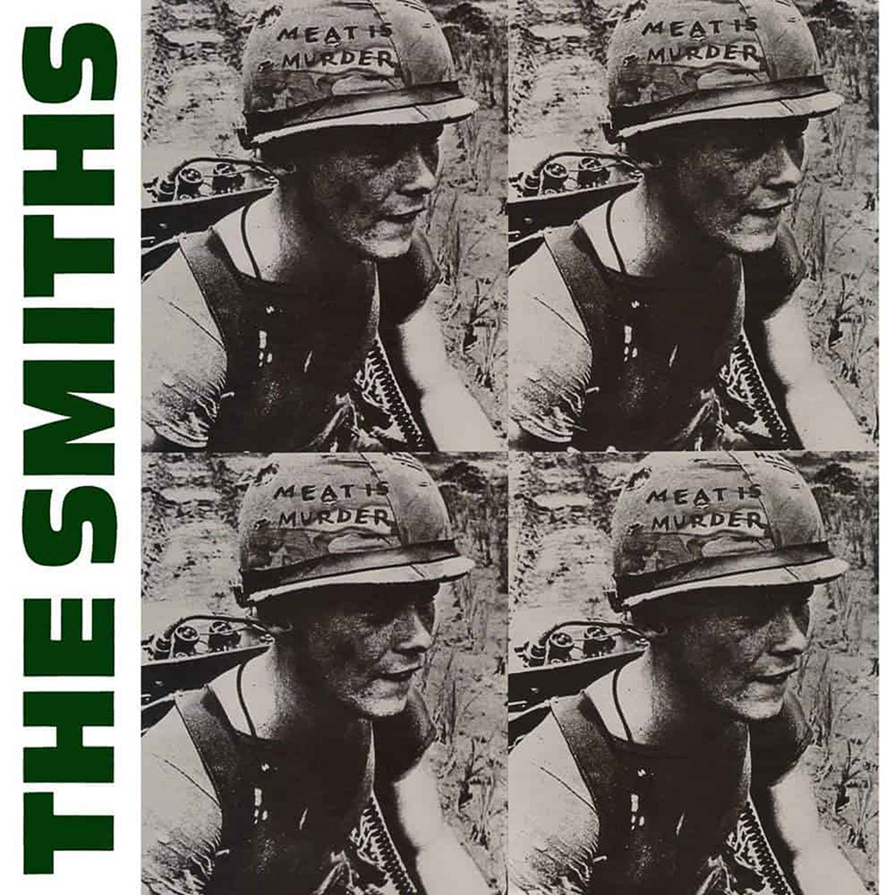
By 1985, The Smiths were only on to their second album release but frontman Morrissey had already gained quite a reputation for not holding back on his opinions. As with Howard Jones this same year, the subject of animal exploitation became the subject of album tracks for both singers, and for The Smiths, it also informed the title of their much anticipated sophomore album release.
The album sleeve of Meat Is Murder was devised by Morrissey and laid out by Caryn Gough. Morrissey selected an image of US Marine Corporal Michael Wynn, from Emile De Antonio’s 1968 Vietnam War documentary, In The Year Of The Pig for the album’s cover. The original message written on the soldier’s helmet ‘Make War Not Love’ was replaced with the album’s confrontational title and the vinyl version, with its Warholian-style image repetition, only helped to amplify Morrissey’s message. In 2019, the reluctant cover star reportedly stated that he had never granted permission for the use of his image and that he “wasn’t real happy” that the wording on the helmet had been changed.
Morrissey himself spoke to NME about the album at the time, commenting that its title was “a direct statement and it seems to me now that, as the front cover image of the LP hopefully illustrates, the only way we can get rid of such things as the meat industry, and other things like nuclear weapons, is by really giving people a taste of their own medicine.”
A Creative Revelation
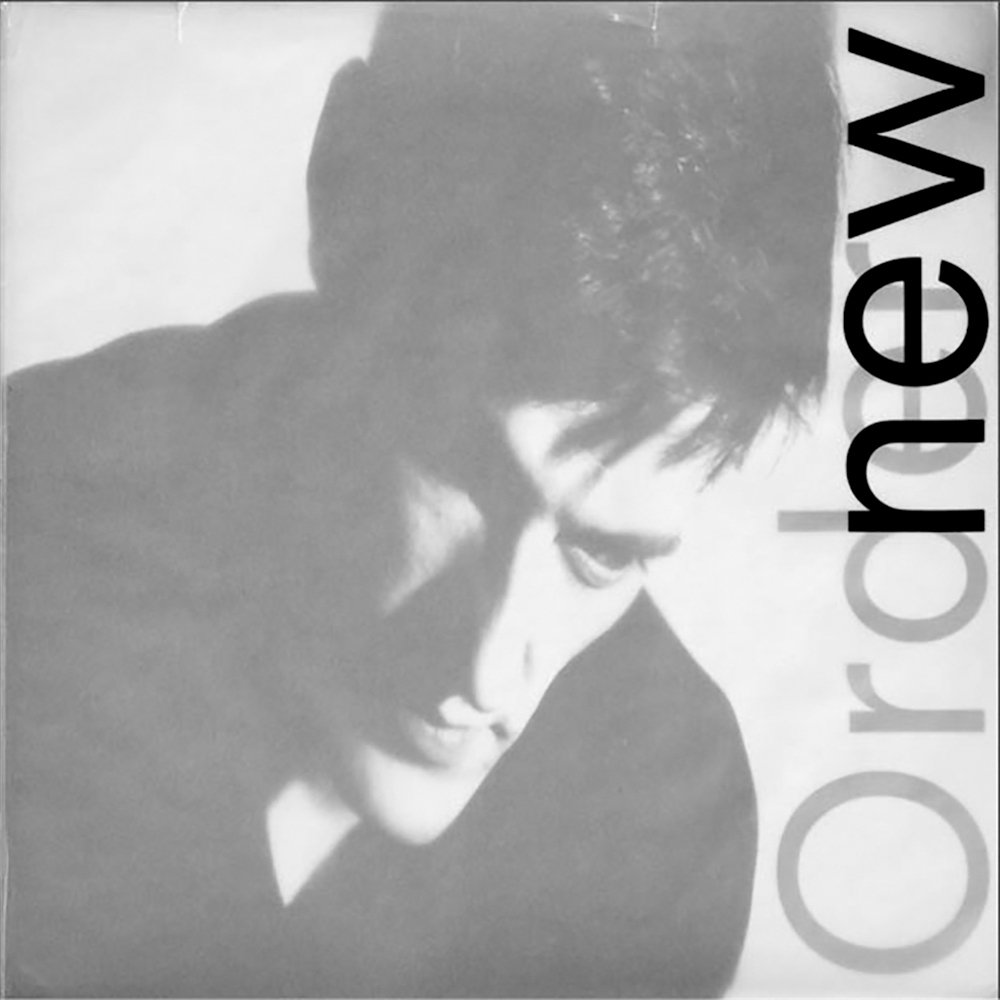
Fellow Mancunians New Order were an album ahead of The Smiths with the release of Low-Life, and it proved to be something of a creative revelation for the band. Its sleeve designer, Peter Saville, opted to step into uncharted visual territory by putting the four members of New Order on their own record cover, something they had not done before. This was a deliberate strategy to demystify New Order, and according to Saville, was due to him growing tired of his previous ‘concept covers’.
The close-up photographs were individually shot with Trevor Key, using newly available Polaroid transparency roll-film which produced 35mm images that could be immediately viewed. “You could push it and do funny things with it. It was very graphic and very dynamic. The grain and the texture made everything look like a movie film,” said Saville. This was highly appropriate as the sleeve’s typography was inspired by a poster from 1960 for ‘der Film’ by Swiss graphic designer, Josef Müller-Brockmann, even down to the half-capitalisation of ‘new Order’ on the cover’s overlay.
The elegant design came together perfectly with Saville’s oversized typography which was printed onto a wraparound tracing paper outer sleeve that partly obscured the cover images. Pet Shop Boys’ Neil Tennant heaped praise on the cover art ahead of the album’s songs in his review for Smash Hits magazine: “Firstly, the cover art is brilliant with a very modern tracing-paper overlay. And the LP inside is easily New Order’s best.”
Trace Chase
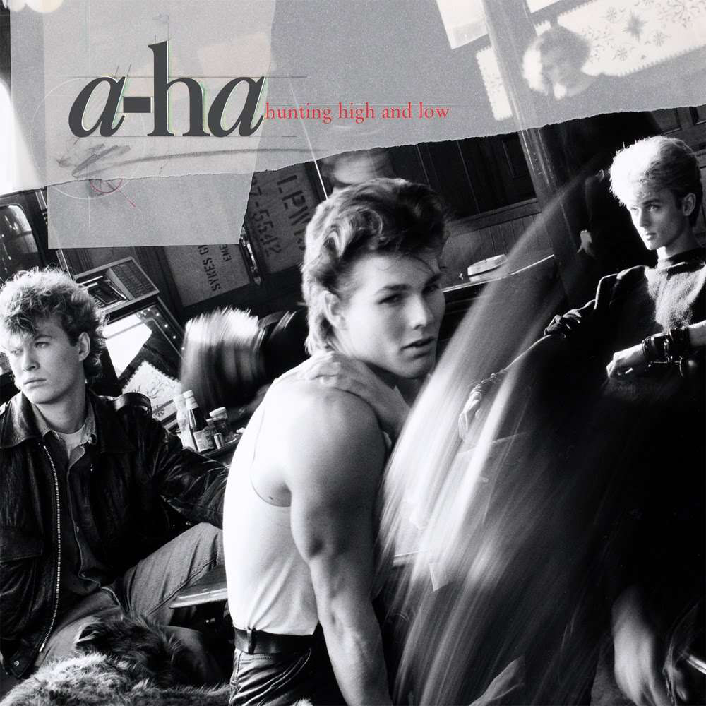
Humble tracing paper layers also inspired another groundbreaking album in 1985, a-ha’s debut, Hunting High And Low. The video for the album’s first single, Take On Me, with its dramatic narrative and innovative rotoscope animation, provided initial inspiration for Jeri Heiden’s design of the sleeve. “I was on staff in the Warner Bros Records art department at that time, and had a front row seat to their transformation,” he said. “We agreed that the band should be presented in an evocative way to avoid appearing too glossy or teen-pop – opting for a vintage black and white, Rumble Fish vibe. I was doing a full-sized mock-up of the cover, using tracing paper overlays, with handwritten and typewritten elements.
Cover mock-ups were made using photostats, drawings, type transfers, paint, ink, whatever was handy. When creative director Jeff Ayeroff saw the work-in-progress he said, ‘That’s it!’, and we used it as the final shooting art for the cover. The approach gave a nod to the video, but also stood on its own.”
The Green Party
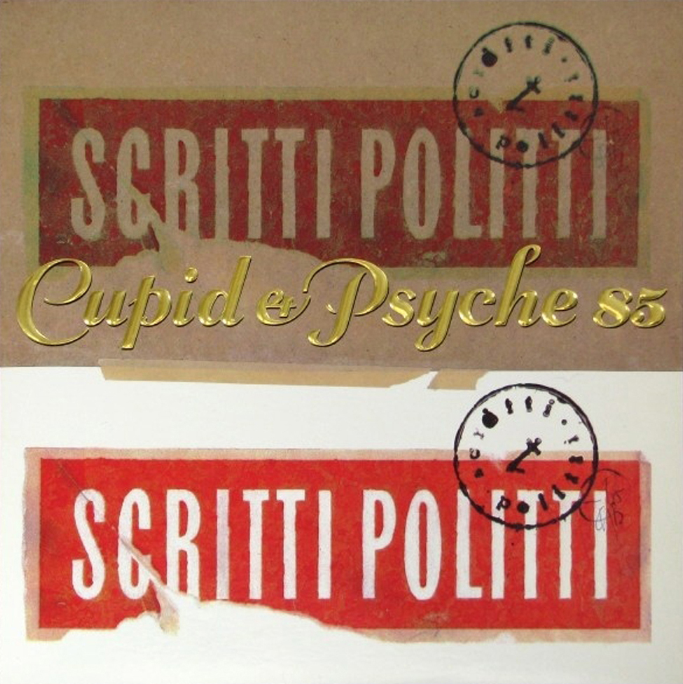
After a three-year break, Scritti Politti came back with a brand new sound and image in 1985 for their second album – Cupid & Psyche 85. This fresh new approach was also reflected in the album’s rich cover design, a sleeve that was as considered as the music it packaged, all impeccably put together by Keith Breeden with Scritti frontman Green Gartside. Said Breeden: “Green intended to use the wrapped meat photograph (that we ended up using on the back) for the front cover, but decided it wasn’t a strong enough image. I had very little time to come up with something else.
Gary Wathen at Virgin was in touch with a company that produced a textured, metallic foil blocking and was very keen that we somehow use it on the sleeve. I knew it could look great, but could also look very tacky. I assembled a collage using screen-printed Scritti Politti logos, stuck together with masking tape and over-stamped them with the logo. I designed a flowing script for the title using a modified version of a typeface I’d seen on a shop sign in Dubrovnik.”
The meaty back/almost front image came from art world interests, as Gartside explained: “It was influenced by a cover for Vogue magazine done by a very famous artist called Marcel Duchamp in about 1920. He did this thing with a piece of meat wrapped up in cloth but they banned it, the magazine never used it because it looked like a very violent image. I thought it was a very beautiful thing and I also thought it was good to put something hard like that on a record that sounds so sweet in some ways, just to show that there is some sort of meat at the heart of Scritti Politti. Then I added motorcycle jacket studs because ‘it’s only rock and roll’ and the butterfly because it’s very light and delicate in some ways. So, it’s all of those things.”
Explosion Of Colour
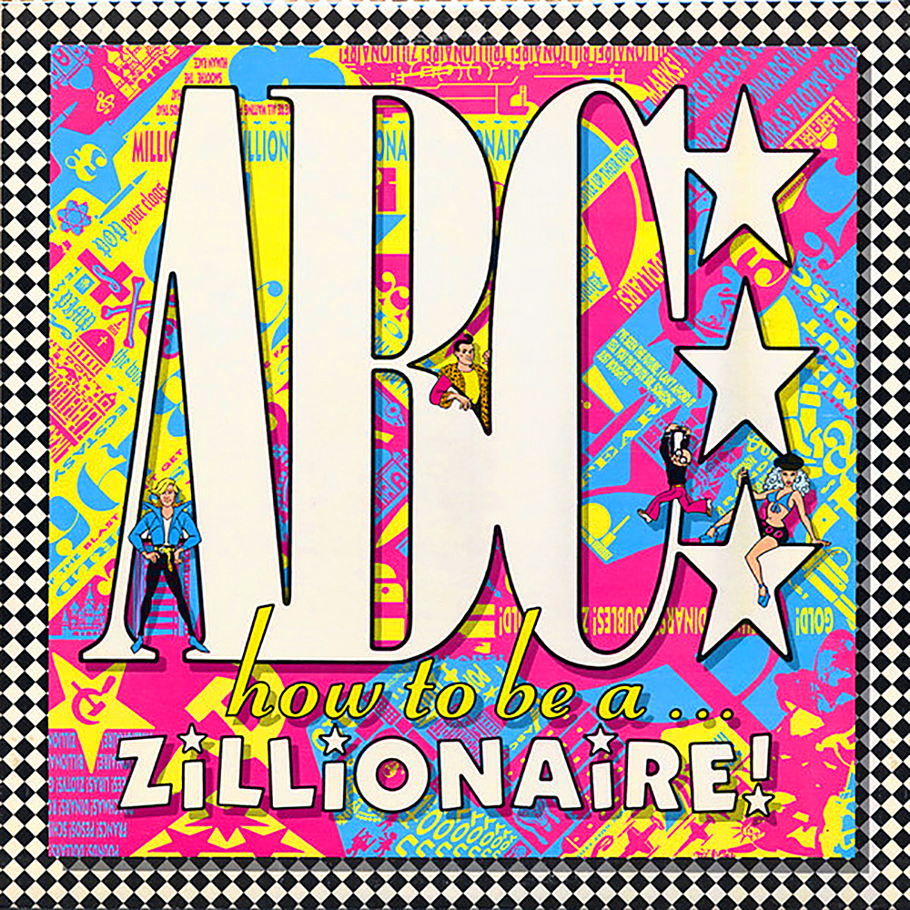
Keith Breeden’s impeccable design skills were in serious demand this year as he also oversaw creative responsibilities for ABC’s third album, How To Be A… Zillionaire!. At this point, ABC, now as much a vivid pop art statement as they were a pop act, were ready to head off into hitherto unexplored musical waters. This fresh new sound brought with it a startling new image and visual identity that would see core members Martin Fry and Mark White, with new recruits Eden and David Yaritu, explode onto the pop scene as cartoon characters – “larger than life and twice as ugly”.
Breeden explains: “Martin Fry and Mark White brought the idea for the cartoons to me. They had already commissioned a company called Best Films to come up with the characters for the animated Millionaire video. I designed the graphics for the album, singles and promotional campaign that complemented and further explored these ideas. I wasn’t aware of anyone else using cartoons and looked at Warner Bros’ Looney Tunes for inspiration. I was also playing arcade games so I guess the result was a morphing of the two styles. Creating the artwork was very laborious, but I felt that we were doing something new and exciting. I remember hearing the rough mixes for the album and thinking there was something special – a lot of energy and vision with all sorts of eclectic references and concerns, I tried to reflect that in the graphics.”
It’s important to remember that at this time computers weren’t the established design tool they are today, which made the visuals and attention to detail all the more impressive.
All Creatures…
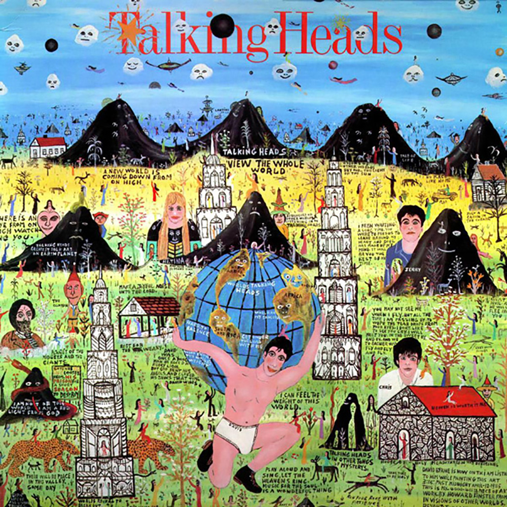
The cover of Talking Heads’ sixth studio album Little Creatures also depicted its four members as cartoon characters, albeit in a less sophisticated rendering via the naïve art of Howard Finster, a folk artist and Baptist minister from Georgia, USA. It was frontman David Byrne’s idea to commission the piece in which he was depicted in his tighty-whities, bearing the weight of the world on his shoulders.
The other three Talking Heads can be seen nestled amongst mountains, buildings, people and some little creatures as referenced in the album’s title – all below a sky of fluffy white clouds with faces. The album’s sleeve art divided opinion at the time, but in the year of its release it was crowned ‘album cover of the year’ by Rolling Stone magazine and Finster gained a whole new audience for his work.
He remained committed to his Baptist mission though, commenting: “I think there’s 26 religious verses on that first cover I done for them. They sold a million records in the first two and a half months after it come out, so that’s 26 million verses I got out into the world in two and a half months!”
Going Global
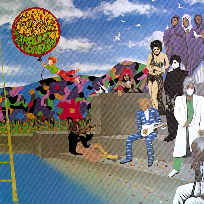
Prince And The Revolution’s album, Around The World In A Day embraced the sounds of psychedelia and this was reflected in the way the album looked as well as how it sounded. Doug Henders’ cover painting nicely encapsulated the experimental mood of the album. It featured an array of characters; some laughing, some crying, all of them utterly intriguing, positioned around a pool with a ladder stretching from its depths up to heaven above.
“Most of the figures on the cover are characters in the songs, but I think some of the people Prince wanted are parts of himself, so they’re all of a piece and somewhat autobiographical,” Henders said. “The little puppy in the picture was added simply because Prince got himself a dog while on the road.”
Prince also said: “The cover art came about because I thought people were tired of looking at me. Who wants another picture of him? I would only want so many pictures of my woman, then I would want the real thing What would be a little more happening than just another picture would be if there was some way I could materialise in people’s cribs when they play the record.”
Side Projects
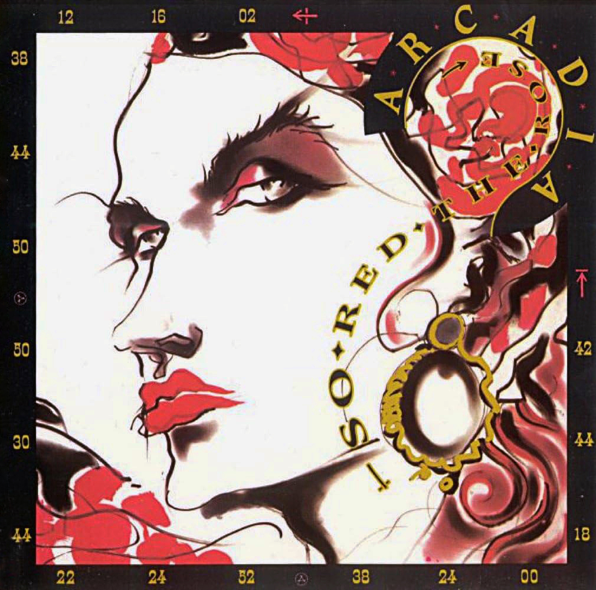
The album So Red The Rose by Arcadia, one of two 1985 Duran Duran side projects, arrived to much anticipation with a lead single and video that teased a whole new level of ‘maximum big surprise’ artiness from its creators. Band member Nick Rhodes had always shown a keen interest in art, and the previous year even had his own exhibition of Polaroids and a book published. It therefore came as no surprise that the Arcadia album would be a visual treat in itself, even if it didn’t live up to commercial expectations.
The album was again packaged in the gorgeous graphic stylings of trusted long-time Duran Duran collaborator Malcolm Garrett, this time using the art of fashion illustrator Tony Viramontes as its focal point. Garrett with David Crow at Assorted iMaGes devised a cryptic numbering system that swirled around and within Viramontes’ expressive cover image of fashion model Violeta Sanchez. All of this added an air of exotic mystery to the packaging, providing us with a numerical code to be cracked. Nick Rhodes himself commented at the time that the cover model “had an elegance to her, an old-style classic beauty.” The album featured many guest musicians including Grace Jones who would release her own album this same year.
Slave To The Rhythm
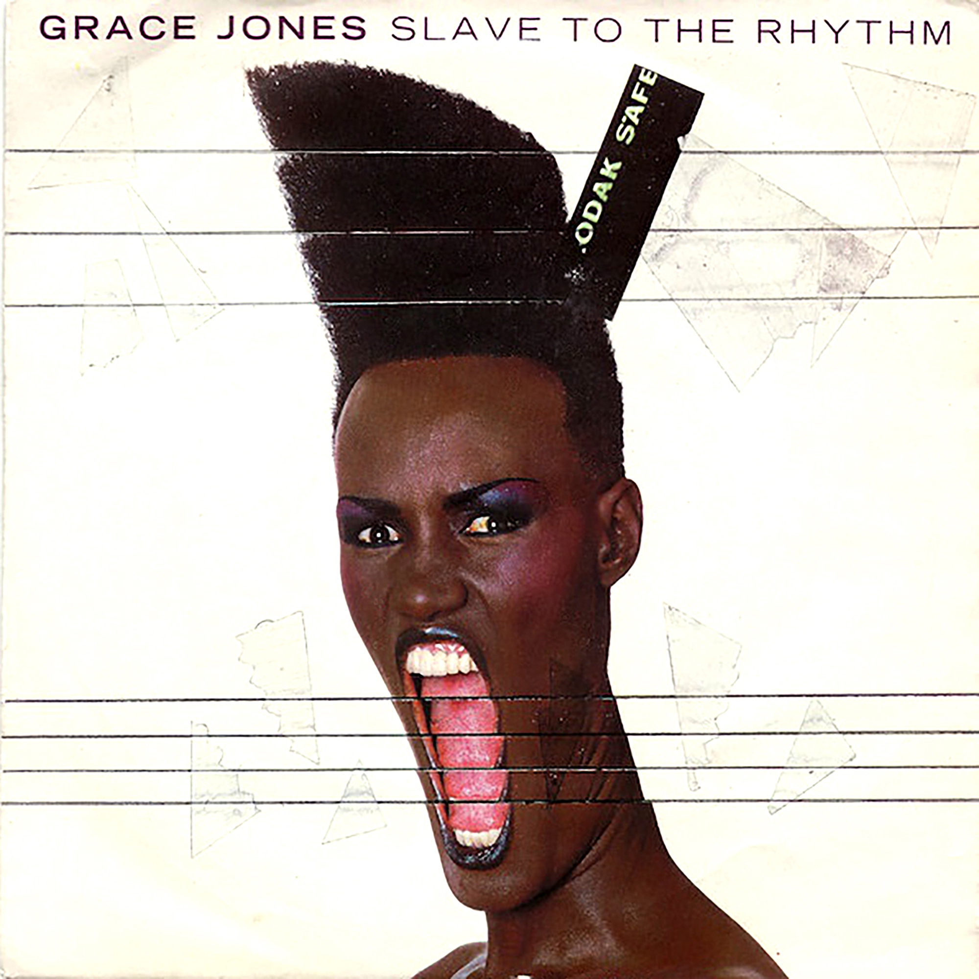
The word ‘iconic’ is often overused, but Jean-Paul Goude’s cover image of Grace Jones for the cover of her Slave To The Rhythm album is surely deserving of such a description. Goude’s shot of his former lover was photographed and repurposed by hand utilising a cutting and extending technique that he used for other artists and advertising clients during this period.
In her 2015 book I’ll Never Write My Memoirs, written with Paul Morley, Jones alluded to where inspiration for the image may have subconsciously originated: “Years later, he [Goude] would use my expression as I gave my final push before our son appeared, my mouth stretched as wide as it could, for the cover of Slave To The Rhythm, one of his most amazing images – he extended the last, big scream, the final push, the birth moment, made my mouth impossibly open, made a still picture appear to be in motion, capturing an extraordinary part of our lives and turning it into art. It was another example of how he told our story, transforming the normal often underestimated edges of everyday life into the truly astounding.”
Hopper Homage
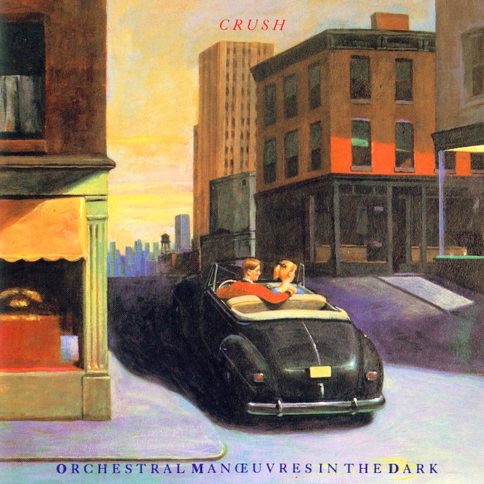
For their sixth studio album, Crush, key OMD band members Andy McCluskey and Paul Humphreys also opted to be represented artistically on their album’s cover art. The original plan was to use a painting by the celebrated American painter Edward Hopper but the prohibitive image licensing fees meant an homage was commissioned instead.
Talking to the Art On Your Sleeve podcast, McCluskey elaborated: “The idea was that if you look at Edward Hopper’s Nighthawks oil painting from 1942, and panned across beyond the frame to the left-hand side, imagine that there were more buildings and a car, and Paul and I were in the windows of the building behind. We were effectively trying to create our own Hopper painting. I don’t remember a lot about the creation of this sleeve as we didn’t work with Peter Saville on this one, and I don’t even remember why. By that stage we were trying to break the American market so maybe Virgin thought a more ‘American’ image might help us.”
Visual Treats
This same year, John Foxx also used a famous and much-revered artwork as source material for the cover of his fourth album. The singer had always been involved in the visual creative process, and to this day it remains integral to the music he makes.
In 1985, after creating collages using fragments of 15th-century Italian Renaissance art for earlier single sleeves, he confidently took on the task of designing his own album cover art. For In Mysterious Ways, he appropriated what appears to be a section of Virgin On The Rocks, a painting by Leonardo da Vinci, and collaged it with torn papers and a solitary white feather, set against a sky-blue flat plane.
In his 2024 book, Electricity And Ghosts: The Visual Art Of John Foxx, he elaborated on his artwork during this period: “I would choose images that seemed somehow significant and tear them out of magazines and cheap art books bought on Charing Cross Road. Arranging these elements together, I would enter into a kind of trance, where things seemed to happen without my conscious intervention.”
The Grinning Man
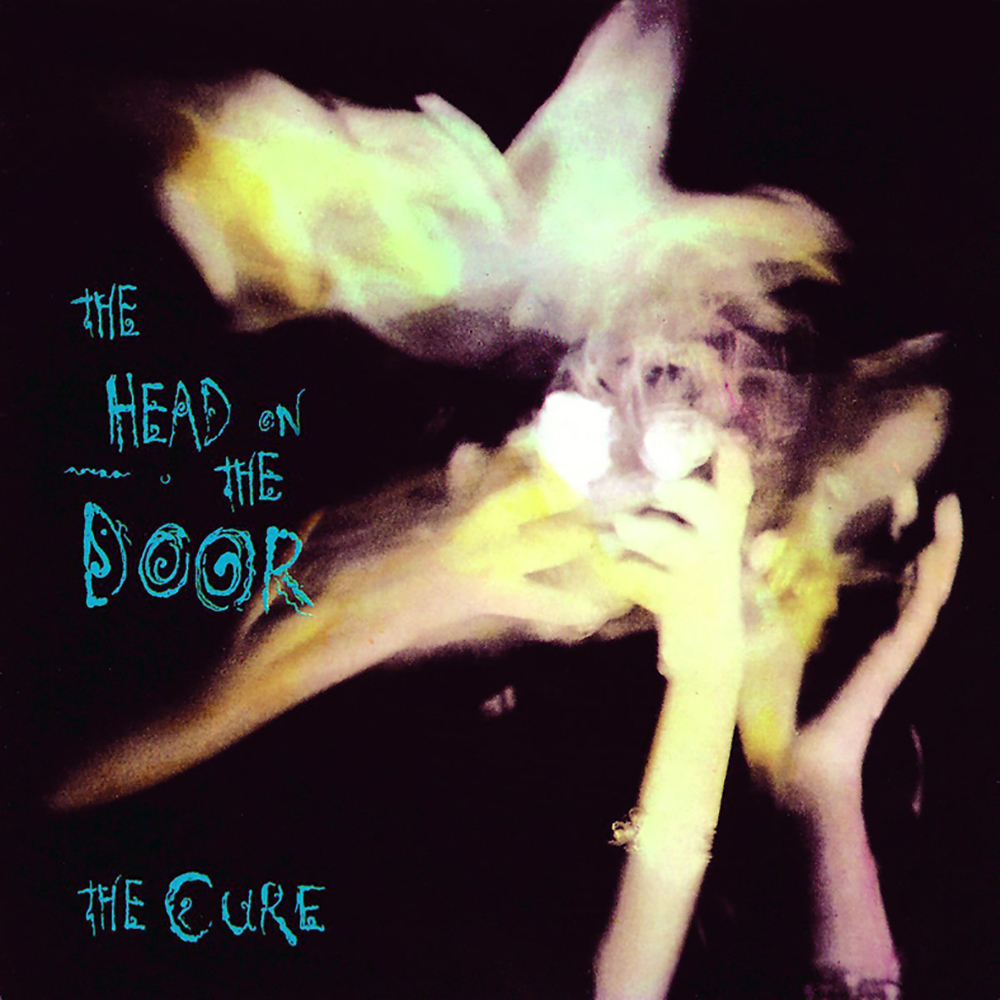
Arguably, The Cure reached their commercial peak in 1985 with the release of The Head On The Door, the band’s sixth UK studio album. Robert Smith at the time told Smash Hits about where the concept and title for the album came from: “It was when I was little. Before I was going to get ill with measles or chickenpox, I always used to see this horrible grinning man who’d appear on top of the bedroom door and laugh. It was like at both ends of a telescope at the same time – really near but when I tried to push it off, it’d be really far away. The last time I had it was when I was 15 and ill with glandular fever. Until, for some reason, a couple of months ago I had a dream about it again and woke up sweating. I thought I was going to be really ill but I wasn’t. I just thought, that’s a pretty obscure title for a record and somehow it fitted the slightly skewed pop record we were making.”
Andy Vella of Parched Art, the design studio behind the album sleeve explained: “We were all in the zone and until the very last minute we held onto what we wanted to do, listening to songs like Push and Close To Me, along with a bit of Captain Beefheart and Syd Barrett just to send us somewhere else. We got the Polaroid camera out and there we were – in the middle of a dream. That’s where that cover image came from.”
Quality sleeve art endures, and four decades later, the greatest albums still have the ability to transport us back to a time when design was a significant part of the pop package, and albums were about so much more than just music.
Read More: Inside the album art of 1984
Subscribe to Classic Pop magazine here
Classic Pop may earn commission from the links on this page, but we only feature products we think you will enjoy.

