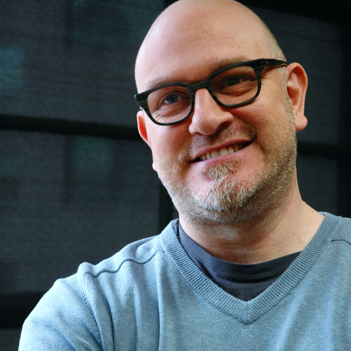
Richard Smith’s creative output includes a diverse range of clients and stellar collaborations. As half of the design duo, Area, the graphic designer’s impressive pop portfolio was hugely influential in the 90s. Written by Andrew Dineley.
How did you get involved with design and was it always your intention to work in the field of sleeve art?
When I was finishing my last year of school in Guildford I spent much of my free time at the local record store or working on a fanzine called Catcrap with a friend. This became the gateway to the rest of my career.
I was on the verge of leaving school and looking to go to college, but had no clue what I wanted to do. Fortuitously, my school career guidance counsellor said: “If you like fanzines why don’t you do this graphic design course at Guildford Technical College?” Within a few months, I enrolled on a City & Guilds course in Design For Print. I was infatuated by the work of Peter Saville and his work married my obsession with Joy Division and New Order with my emerging design sensibilities. At the end of the course, I signed up to do a HND at the London College of Printing. Then, once I had graduated, I had to start looking for a job.
A friend of my older brother worked at Pentagram and I started a brief internship there. My brother’s friend gave me a list of agencies that Pentagram worked with to help me search for a job. One of those agencies was Peter Saville Associates (PSA). When I called them, Peter answered the phone and, within a few minutes, I had arranged a meeting. On the day of my interview I waited several hours for him to arrive (I later realised this was ‘normal’ for him) and at the end of our very interesting conversation, I was offered a job.
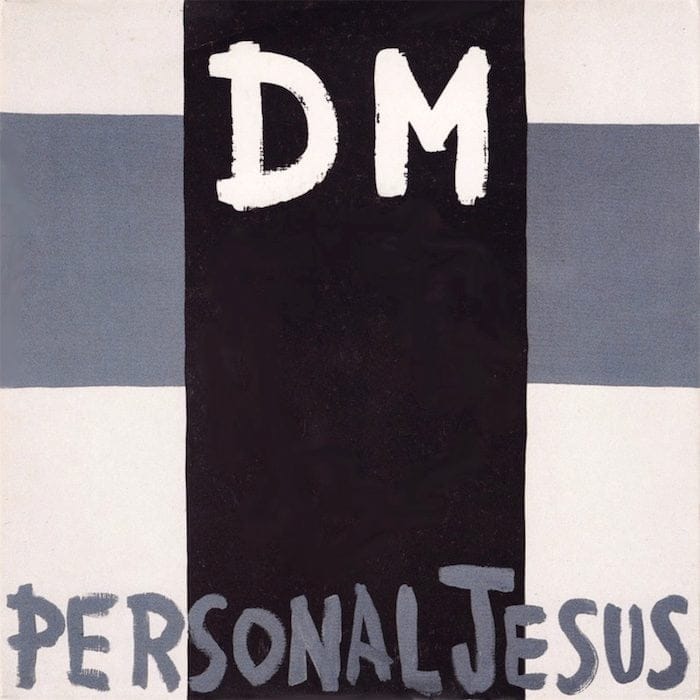
What was the first sleeve design commission for you after the formation of your own design studio, Area, at the end of the 80s?
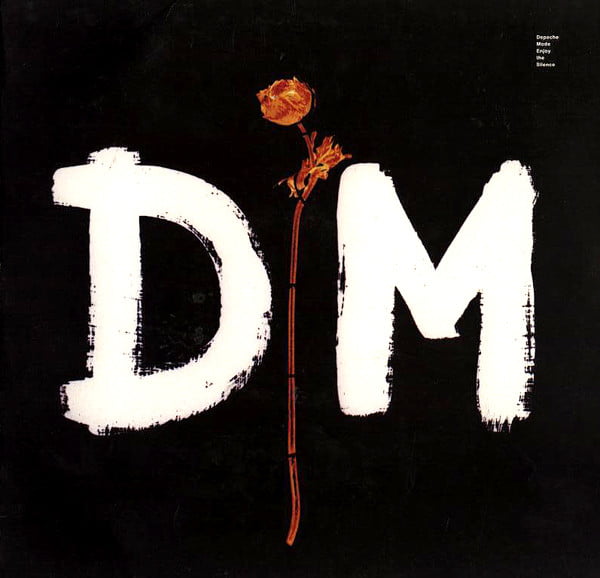
It was Personal Jesus, the first single from Depeche Mode’s 1990 album, Violator. For Personal Jesus, Anton Corbijn created the entire cover sleeve as a square painting, which we photographed. This approach became challenging when the record company asked for a cassette version or a rectangular in-store poster… anything that wasn’t square.
For the follow-up single Enjoy The Silence, I asked Anton to break it down into components that I could move around, colourise, edit and so on. Most of the ideas came from Anton, but, the more I worked with him, the more we discussed ideas. At the beginning of every new album he usually had a very clear idea about what he wanted to do. However, as I gained his trust, he leaned on me increasingly to do more of the design.
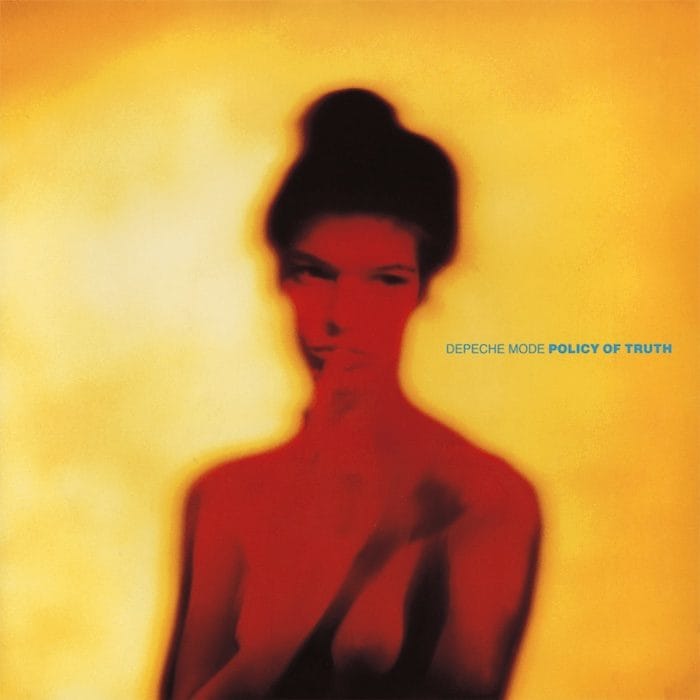
For Depeche singles Policy Of Truth and World In My Eyes, you moved away from the naturalistic forms and dominant darkness, to embrace more vivid colours and portraiture.
Before Policy Of Truth I’d worked with Anton on a catalogue for a fashion designer called Koji Tatsuno. He’d just started shooting colour photography after years of black and white. The imagery in that fashion catalogue utilised the same ‘painted light’ photo style as Policy Of Truth. The process exaggerated the film colour, so you ended up with supersaturated or bright images. World In My Eyes happened quickly. I think Anton shot some photos of the band around New York and that became the imagery for the sleeve.
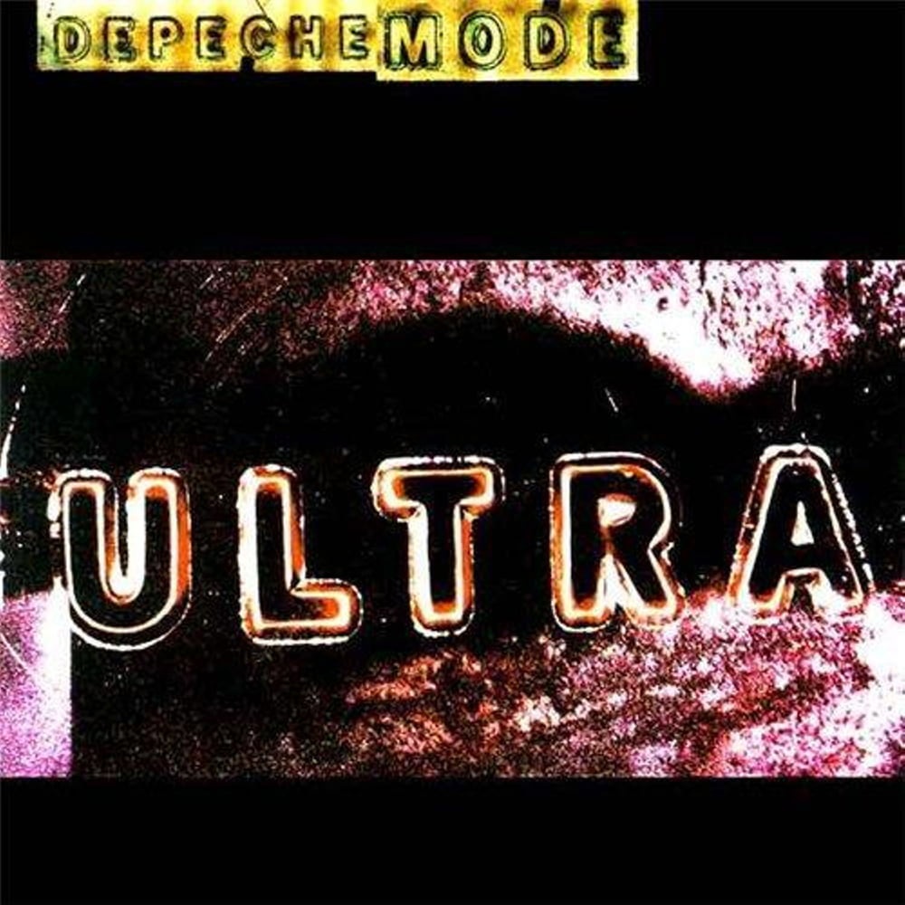
For the Ultra campaign in 1997, you incorporated a range of source material into the designs – from drawings and photographs to iconography…
For the cover of Barrel Of A Gun, Anton allowed me to do whatever I wanted with his photos and I fully capitalised on that. I was really into this fake handmade aesthetic at the time, using the computer to create a low-fi, scrappy design style, where I composed scans of my handwriting and drawings. Anton mentioned something about how Dave Gahan fades away in the image and how symbolic it was – I think that was because of what was going on with Gahan personally. There was a lot of uncertainty about the future of the band at that time and the music also had an aggressive edge. I think the sleeve design reflected that. Mute boss, Daniel Miller, told me that he thought it was the best sleeve Area had designed.
For the Ultra album cover, the lettering was made by projecting stencil characters on to photographic paper. It was a really interesting technique. There is an odd aesthetic for most of the singles (Home, Useless and It’s No Good) from that campaign. They seem to go from the intense to the bizarre to the juvenile. For each single, Anton gave us all the pieces and we put the cover designs together from those.
As well as Depeche Mode, Mute Records commissioned you to work with Nick Cave and Nitzer Ebb.
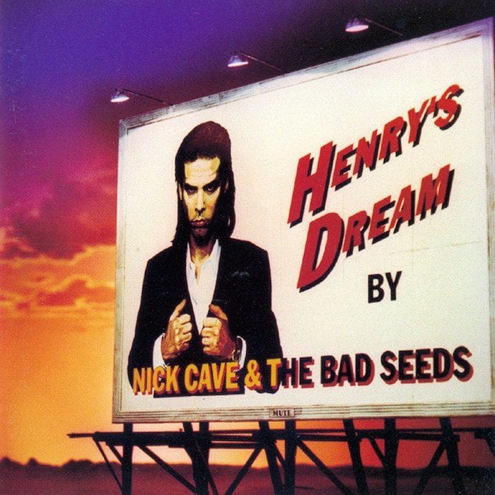
I did a couple of different projects for Nick Cave. I think the Henry’s Dream material came first, which was another Anton collaboration. He came up with the idea of using a billboard and I created the supporting graphics. It was this Pulp Fiction reference. As Is for Nitzer Ebb was a one-off. They were really into skateboarding, and liked the idea of riffing off corporate graphic language. They really liked that industrial aesthetic so I think that’s where it started.
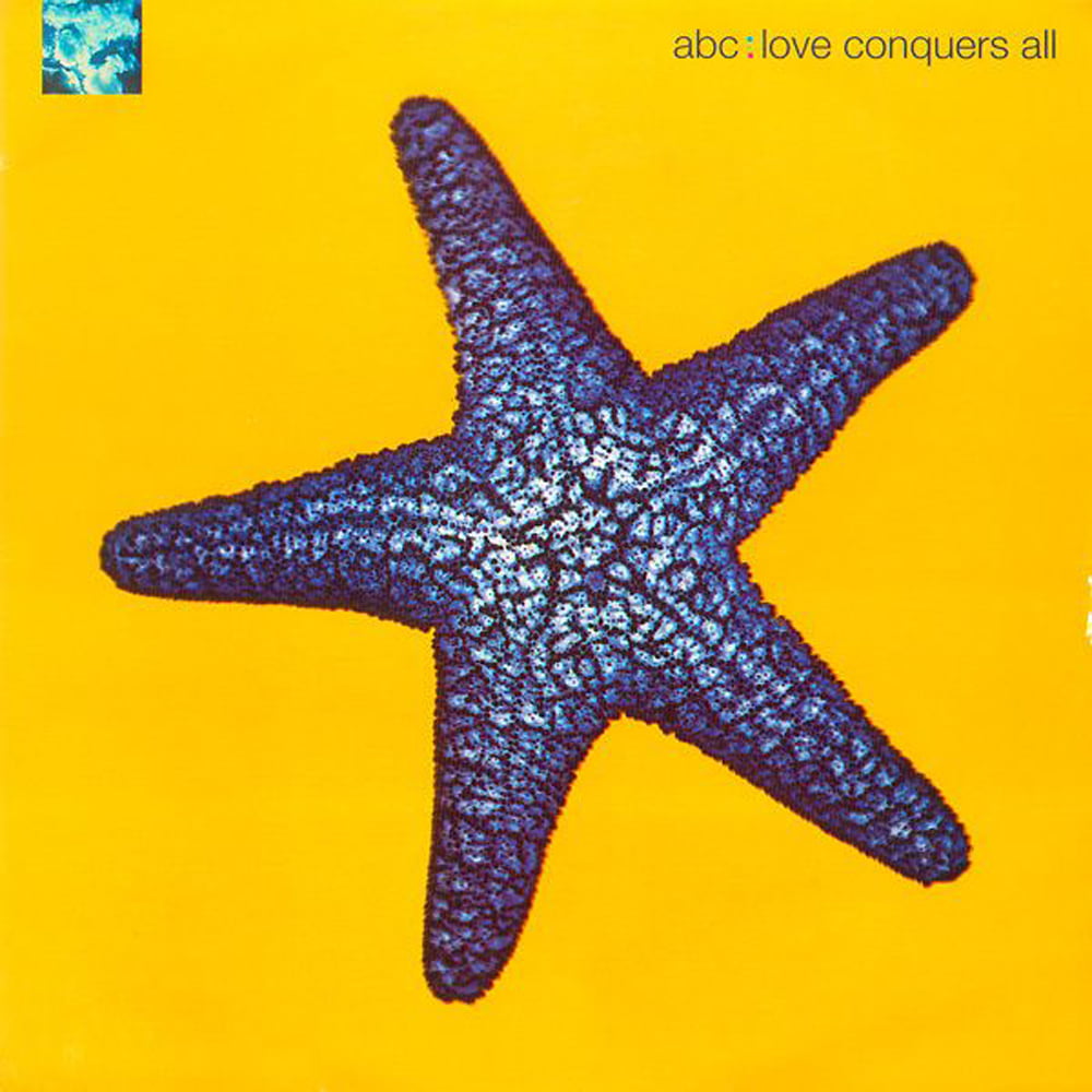
In 1991, you worked with ABC on the sleeve of their album Abracadabra and its singles, Love Conquers All and Say It. The album cover shared some visual themes with Enjoy The Silence – an organic element against a Yves Klein-esque blue background.
There was no conscious decision on my part to do something similar. Many bands came to Area following the success of Violator, and because Depeche Mode had been able to turn a corner away from their ‘pop’ past. We had a few different ideas for ABC, but landed on the idea of using Lewis Mulatero’s photographs of seashells, seahorses and starfish. I think the overarching narrative was based on the fact the band had a new style, so there were definitely aspects of the past they wanted us to help lose. At the time, Peter Saville and Trevor Key had been doing all this cool dichromat imagery for New Order, and Nick Knight had been experimenting with colour processing. I think their developing styles got picked up across the musical landscape.
In 1991, you went on to work with Trevor Key, creating several sleeve designs for OMD. What was that like?
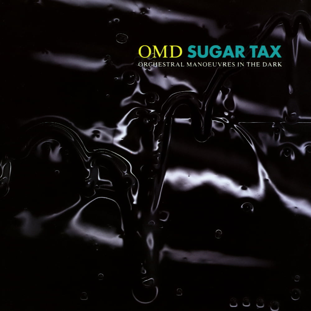
I’d always dreamed of working with my favourite bands and musicians. I managed to do that with OMD and it really was an honour. With OMD, we had sent our book to Virgin Records and the art department arranged a meeting for us with Andy McCluskey. We were able to trade ‘war stories’ about working with Peter Saville and we bonded over our memories. The image for Sugar Tax was based on an invitation we created for a London art gallery show. The artist used oil in his work to create striking images and Andy loved it. There was no one else I knew who could shoot the image other than Trevor and that final shot used dish detergent on plexi-glass.
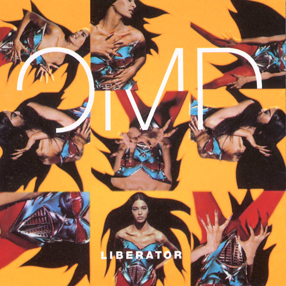
The sleeves you worked on for OMD varied in style, particularly the glamorous follow-up album, Liberator.
It was all about an expression of the song or what the song was about. I think that was the reason why all the sleeves were all so different. Usually the first single, album, and maybe the second single, all had a similar feel. The story behind the sleeve for Liberator is a little more interesting than some of the others we did. The original sleeve was banned by Woolworths because it was too raunchy. Andy McCluskey really liked an image we found by Stéphane Sednaoui, which was originally created for The Face magazine. Andy wanted his own version, so we commissioned Stéphane to shoot a similar series of images. Our model was wearing a Jean-Paul Gaultier body suit – with fake nipples and hair – so she looked nude. It was more provocative than the original, but it made its way through the entire process and it was only when Woolworths complained that we had to come up with an alternative. So, we reverted to Stéphane’s original shoot for The Face. They were less provocative, but still worked. Andy was still thrilled that he’d had something banned by Woolworths.
For OMD’s 1996 album, Universal, Peter Saville had shown Andy something similar to the final cover image. Peter may have even created something that we repurposed or redrew. But we didn’t actually work with him on the sleeve design beyond that. I think he just got a credit because it was his original idea and we liked the association. The images were created in a 3D modelling programme and we developed variations for different purposes: posters, inner sleeves, the Walking On The Milky Way single etc.
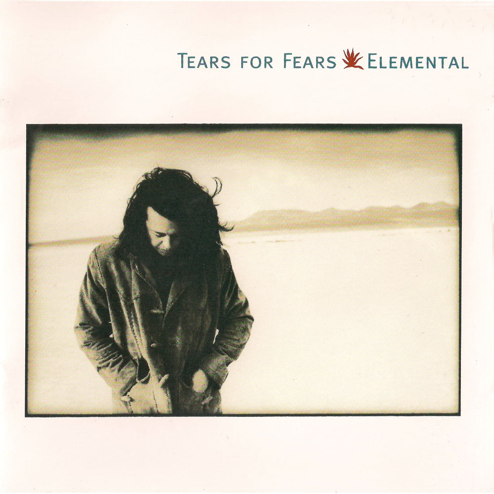
Your work for Tears For Fears was predominantly photographic. Was this a conscious decision with the band now being a solo vehicle for Roland Orzabal?
We had been working with an artist called David Austen on a gallery project and showed Roland some of his work.
It was a lot like Matisse’s work, simple collage cut-outs, and I think, because of the earthy spiritual quality of David’s work and the title of the album, Elemental, there was a vague connection there. Roland was definitely on a spiritual journey, so I think much of that came through in the cover design.
In the mid-90s you worked with two 80s icons, Kim Wilde and Adam Ant. Was there any pressure for the design work to reference their commercially successful past?
I forget how Kim Wilde came about. I remember we were on vacation and somehow, I managed to orchestrate a shoot. I remember she came across as being very self-conscious about her looks at the actual shoot. But there was no request to relive the past.
Adam was another person Corbijn put us in contact with. Adam didn’t get involved in the design and we only met him a few times – we mostly worked with Marco Pirroni.
Are there any sleeve designs you’ve worked on that you remain particularly proud of?
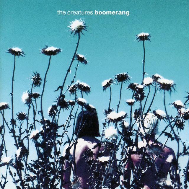
Barrel Of A Gun, but I also really like the Songs Of Faith And Devotion Live sleeve. Because of its pure typography and atmospheric photography, I’d say another favourite is Boomerang by The Creatures.
I’ve always felt really lucky throughout my career and I’m proud that, despite having no clue what I wanted to do with my life, I’ve somehow stumbled into something I love!
More recently, I’ve held the position of creative director at Sullivan brand engagement agency in New York City.
The work I do now is a far cry from those early days, but I still apply the same principles and I’m still driven by the same subversive attitude.
Record cover design is relatively easy. There’s something about what I do today that feels more satisfying, more challenging, if not as important culturally.
Read more: Pop Art: Jean-Paul Goude
Classic Pop may earn commission from the links on this page, but we only feature products we think you will enjoy.