Pop Art: Jean-Paul Goude
By Classic Pop | June 27, 2018
Jean-Paul Goude is a creative tour de force whose prodigious output transcends multiple creative disciplines. From advertising and art to film and fashion, the aesthetic he established with Grace Jones remains as divergent today as it did at the dawn of the 80s. Written by Andrew Dineley.
Jean-Paul Goude met Grace Jones in New York in the late-70s while he was working as art director for Esquire magazine and the diva-in-waiting was forging a mainstream disco career. An ascending star was in the making but the Grace Jones we think of today was yet to be reborn and released into the wider musical and artistic arena. Initially, Jones’ image very much reflected her physical and musical surroundings. As an established part of the Studio 54/Warhol pop art glitterati, her image naturally complemented what was going on around her. Her first three album covers were art directed by Richard Bernstein – the man behind the cover designs of Andy Warhol’s Interview magazine. Jones, like every other glamorous subject that graced the cover of Interview, had previously been presented in airbrushed, hyper-saturated hues and treated to the perfect disco demeanour. This celebrity cookie cutter formula had run its course for her though.
Believing that Bernstein had softened her look, colouring her in shades of green and navy blue, Jones felt there was a better understanding with Jean-Paul, whose more aggressive approach reflected her striking sense of self. In her 2015 book, I’ll Never Write My Memoirs, Jones said: “Jean-Paul dug into me, bit into me, scratched and stretched me, and made very clear what the colour of my skin was.”
In 1978, Goude first worked with Jones for an article in The New Yorker magazine. The end result was a visual triumph that would go on to be much copied and parodied. It would also be used again seven years later as the cover of Grace Jones’ 1985 hits compilation, Island Life. Goude has talked about this acrobatic, lithe image – the result of slicing, dicing and even, according to Jones herself, the insertion perhaps of other people’s parts! “What I’m interested in is the illusion of reality and unless you are extraordinarily supple, you cannot do this arabesque,” he says. “The main point is that Grace couldn’t do it, and that’s the basis of my entire work: creating a credible illusion.”
Jones elaborated: “I thought it was beautiful and, of course, I would eventually realise that as much as it was about me, it was also about Jean-Paul.”
The notoriety that the iconic image would gain was inevitable, as was the formation of their creative partnership. As the 70s ended, Grace Jones was ready to stand out from the crowd. Jean-Paul Goude’s visual re-imagining of Jones was as radical as the musical change in direction it would mirror. The sounds and visuals went hand-in-hand, as did he and Grace during the period, as a tempestuous love affair bloomed and the two worked as an inseparable and irrepressible creative unit. It would seem that Goude had a vision from the start about how, what many have described as his muse, should be re-invented, and to this day some of the visual statements remain controversial. Goude has, however, always owned his aims and ideals. He said: “It all starts with drawing. I am obsessed by proportions and I’ve done that all my life to myself. Cutting up pictures, doing sculptures that idealise people.”
Over the years there have been allegations that he objectified her, cutting her up and making her into something new that he wanted her to be, flirting with plenty of taboo imagery along the way. She, however would defend herself and him against any such assertions, claiming quite the contrary, that it was also “about stripping back prejudice”. Jones explained: “It was about rejecting normal, often quite sentimental and conventionally crowd-pleasing ways of projecting myself as a black singer and a female entertainer, because those ways had turned into clichés, which kept me pent up in a cage.”
Criticism of their collaboration that may portray Jones as a victim of artistic exploitation, an unwitting casualty to Goude’s desires, may overlook the fact that the star herself had been in control of her artistic destiny almost from the start, and from her recent memoirs it is apparent that she was never a slave to the vision of Goude. Jones saw herself not as a model, but a “partner in design”, transforming the story of her life into “a series of visions and fantasies”.
This defiant new design of Grace Jones as an androgynous artwork was an important part of her reinvention. An image that was perfect for the time and one that would endure for a run of four albums, all designed with Goude and all released with Island Records.
The icon was born and the fanbase was swelling, along with commercial success and arguably also her infamy.
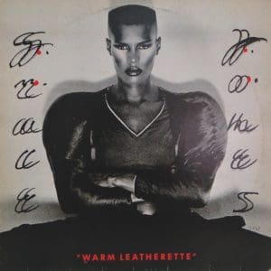
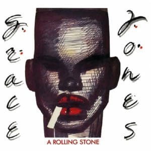
In 1980, Grace Jones released her acclaimed album Warm Leatherette. Goude’s monochromatic sleeve image was in massive contrast to everything that had gone before for her and fitted in comfortably with a period that saw gender bending normalised. Goude’s perfectly symmetrical sleeve image of Grace was a stylistic precursor for what was to be found in some of the sounds within – angry and angular, oozing a forthright confidence that would set a strident tone for the albums to come. A Rolling Stone was released as a single from this album and for the sleeve image; Goude opted to use one of the copious portraits he created of Jones during this period. The hand lettering used for the single naturally matched that of the album, but the portrait exaggerated her features, potently shifting her colour and form. The single sleeve may also have been a study for the album that would follow, also showing the artist with a long cigarette hanging from the right side of her mouth.
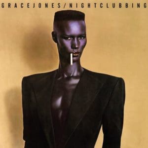
The Nightclubbing album in 1981 saw Jones’ image elevated further into the artistic realm. Was it pop or was it art? Was it human or machine, man or woman? This image of Jones as the austere alien was another perfect marriage of sound and vision. It also further consolidated her artistic ambitions on an album that would contain career-defining singles including Pull Up To The Bumper and Walking In The Rain. The cover photograph has to have taken inspiration from Vladimir Tretchikoff’s famous Chinese Girl painting from 1952, where the glowing subject, exactly like Jones here, is shown turned slightly to the left with glowing blue skin, bright red lips and dark hair against a murky anodyne background. If the resemblance is a coincidence, it is an amazing likeness albeit with their respective images of femininity being diametrically in opposition.
In 1982, Goude directed a groundbreaking, long-form video for Jones entitled A One Man Show in which she performed many of her biggest hits amid a variety of minimally modernist sets. They worked together on a photograph that showed Jones in a cage with raw meat, labelled “Do not feed the animal”. These provocative images were collaboratively devised to shock. By this time, disco was officially considered dead in the US and in the UK punk had ripped up the rulebook a few years earlier.
Goude’s striking case image for the A One Man Show film depicted Jones’ stern profile, with a lifelike mask and various cubist facial adornments being pulled away to reveal the character behind. A more detailed, wider shot variant of this scenario was also used a year earlier in a photograph entitled Libertango.
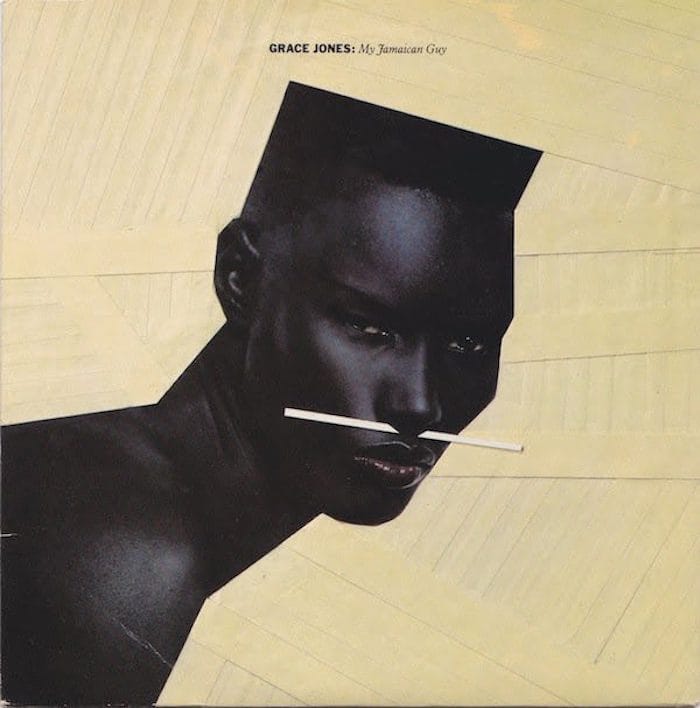
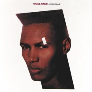
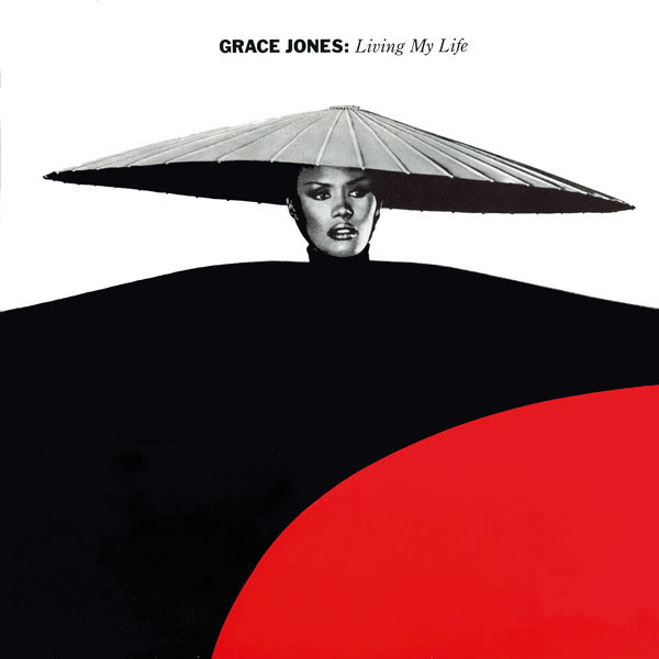
In 1982, Jones released her album Living My Life. Goude worked on the cover image once again and was assisted by Rob O’Connor of Stylorouge (See Classic Pop Issue 32) with the graphic design and layout. While the cover image may appear rudimentary by today’s standards, O’Connor explained that in order to get the perfect image: “Jean-Paul would labour over dozens of large format transparencies, each with a different exposure. This was done to achieve an ideal colour balance and also to remove the white camera tape that was used to mask off the image edges to get that sharp, angular look he was after.”
A similar cutting and taping technique was also used, and is more evident on the cover of the single for My Jamaican Guy from the same album.
In 1983, the sleeve image that Goude shot for the cover of the single, Living My Life featured the singer as art once again. The look had been used in video – all sharp angles, slabs of fl at primary colour and eccentric costumery that by this point was an established trademark. There is an exoticism and detached cool about so many of the images from this period. Every image was a strategic, bold statement.
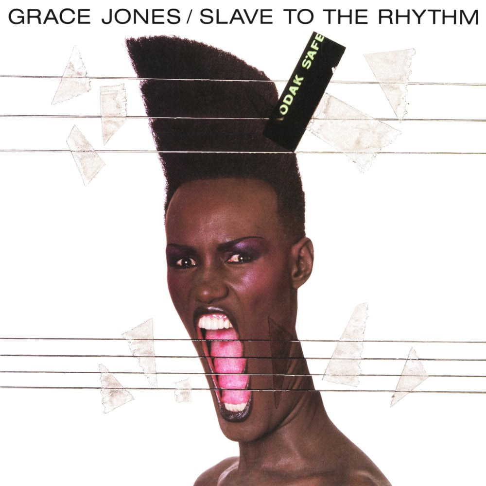
By 1985, the intimate relationship between Jones and Goude was history, but visually the best was yet to come. The cover image that Goude photographed and repurposed by hand for Slave To The Rhythm utilised a style that he was fond of during this period. This cutting and extending was a technique that he’d already used for clients in the advertising world and he also used a similar image on the cover of a single released a year earlier by Cristina entitled Sleep It Off. It was a radical style, too important to let slip into obscurity so using it on the covers of the single and album gave it more appropriate prominence. In her book, Jones alludes to where inspiration for the image may have subconsciously originated: “Years later, he would use my expression as I gave my final push before our son appeared, my mouth stretched as wide as it could, for the cover of Slave To The Rhythm… It was another example of how he told our story, transforming the normal.”
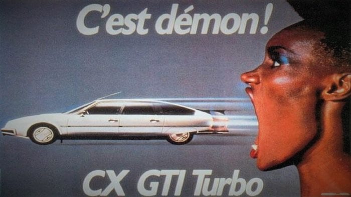
This transformation also extended further into Goude’s advertising work as he famously used Jones image in press advertising and TV commercials for Citroën. Coming full-circle, some of these advertising images were then re-appropriated and reused in the remarkable video for the hit single.
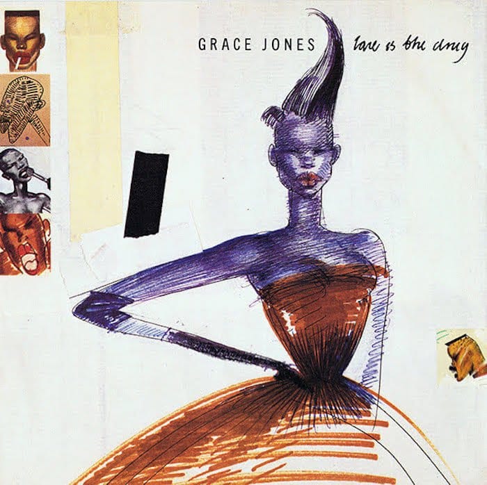
Building on the commercial success of Slave To The Rhythm, some of Jones’ back catalogue was re-released that same year and Love Is The Drug, a single from five years earlier appeared once again, this time with Jean-Paul Goude imagery on its sleeve.
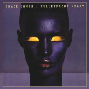
A change in record company saw four years pass before Jones and Goude would work together again but visually they picked up roughly where they had left off. For the album sleeve of Bulletproof Heart in 1989, they used an image of Jones stylistically reminiscent to some of the photography used in the Citroën advertising. The Grace Jones with the bulletproof heart was now half woman, half machine, all cybernetic chic.
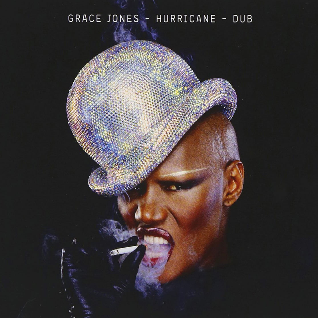
Returning back to humanity, for 2011’s Hurricane – Dub we see Grace Jones depicted as a strong woman once again. Goude’s powerful photograph shows the star defiantly glaring out from the cover, with all detached robotic artifice replaced with fierce showbiz glamour. This is Grace Jones as show woman, resplendent in a bejewelled hat. This is an image of Grace that is looking forward with only a cigarette perhaps visually hinting to any identifiable past.
Some quotes in this feature are taken from I’ll Never Write My Memoirs by Grace Jones and Paul Morley. Published by Simon & Schuster, 2016.