Depeche Mode’s cover art is among the most imaginative and visually arresting in music. Andrew Dineley revisits some of their very best designs…
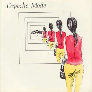
 Depeche Mode‘s 1981 debut single set an important visual trend for the band that would endure to the present day, with the band almost always opting out of appearing on their sleeves.
Vince Clarke’s opaque lyrics probably didn’t help influence their early sleeve designs, so Dreaming Of Me instead featured an ambiguous illustration of four diminishing, identical figures. This uncredited work was by Mark Crick, a schoolfriend of Martin Gore, who would go on to find acclaim as an author and photographer.
This deliberately obscure, almost Delphic design heralded the visual birth of Depeche Mode, who would go on to embrace the best talent from the worlds of design and photography.
In this cover art of Depeche Mode feature we look back at some remarkable examples from a visual portfolio spanning more than three and a half decades…
 New life, new look
 New life, new look
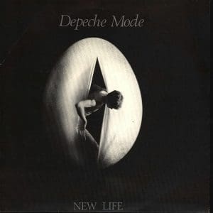
Depeche Mode’s chart breakthrough single New Life heralded what would become another tradition for the band – singles with unique sleeve designs for their 7” and 12” formats.
The New Life 7” featured a moody black and white photograph by Rodney Martin, possibly of Dave Gahan emerging from a giant egg – a rather literal visual interpretation of the song’s title and an homage to a 1943 painting by Salvador Dali entitled Geopoliticus Child Watching The Birth Of The New Man.
The theme was alternatively explored by Simon Rice with his illustration for the 12” single – a reworking of a 1968 cover image from Mind Alive magazine featuring a crying baby with its eyes alarmingly obscured by a black bar. If the lyrics were confusing, these images only added to the mystery.
Just Can’t Get Enough saw Depeche Mode finally break the UK Top 10, and its two sleeves – designed by notable graphic designer Neville Brody – took the band in another visual direction.
The results, particularly in the 12” format, were considerably more challenging than the commercial pop tune they packaged, with a grainy, manipulated cover image depicting a bound and blindfolded figure starkly in contrast to the song itself.
The 7” sleeve variant featured a fluffy white cat, an image appropriated from another vintage magazine, this time an advert for Kosset carpets.
That same year Depeche Mode’s debut album appeared with a sleeve that again confounded its audience. Speak & Spell, with Brian Griffin’s brooding photograph of a nesting swan in a plastic bag, wickedly belied its pop contents.
“Brian Griffin did the photography,” confirmed Daniel Miller. “Before we met, I’d been a fan of his work with artists like Devo and Siouxsie. The photograph divided people – I’ve no idea what it means, and I’m not sure that Brian does either!” Brian Griffin would go on to create many more images for the band.

The album’s graphics were the work of another acclaimed designer, Barney Bubbles, famous for his work with the Stiff Records label. With Speak & Spell, many failed to notice how Bubbles subtly constructed the album’s tracklisting on the back cover to form the shape of a chess piece, complete with a king’s crown.
This restrained design is atypical of Bubbles’ work, and his contribution went uncredited on the sleeve.
Get Classic Pop’s Depeche Mode special here
Outside the frame
By 1982 Martin Gore had inherited sole songwriting responsibilities and needed to decide whether the new three-piece would continue down the pop path or risk something less colourful and commercial.
The two sleeves for See You, Gore’s first single for Depeche Mode, in some ways illustrate the existential predicament the band found themselves in that year. The 7”, with its naïve cover painting and hypersaturated graphics by Moritz Reichelt’s Ata Tak studio in Düsseldorf, was unlikely to convince Depeche Mode sceptics that something different could be expected.
Its 12” format, however, with its restrained neo-classical sleeve, again by Simon Rice, was more complementary to the maturing sonic aspirations that would follow with the release of the band’s sophomore album, A Broken Frame.

A Broken Frame is rarely cited as a fan favourite, but Griffin excelled himself with the cover image. It went on to be selected by Life magazine in 1990 as one of the best photographs of the decade, and remains rightfully respected to this day.
It was during this period that Martyn Atkins took on regular design responsibilities for the band. “I used to run sleeve ideas by Dave [Gahan] in those days,” he recalls. “Depeche Mode didn’t have a manager so each of the guys had an area of the band’s affairs to deal with. It was great,” he added, “no bullshit third parties to deal with!”
Between albums, Atkins’ sleeve for the single Get The Balance Right! took inspiration from an unexpected source whilst subtly introducing visual elements that would feature prominently on the album and singles to follow.
“The colours for the sleeve came from my favourite chocolate bar at the time, the Milky Bar,” he explains. “Graphically I was trying to make the cover very mechanical and European in a Kraftwerk kind of way. The little men on the sleeve were doctored from a Letraset catalogue, with hammers giving a nod to the Construction Time Again cover we had designed.”
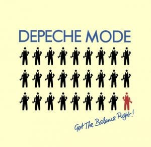
Image building
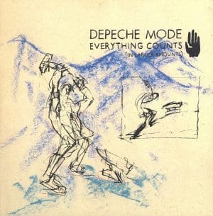
For the 1983 single Everything Counts Atkins opted for a contrasting aesthetic, with roughly-drawn pastel sketches replacing bold graphics and sumptuous photography.
These uncredited sleeve sketches were the work of illustrator Ian Wright, who was given advance copies of some of the beautiful images Brian Griffin had taken of the Swiss Matterhorn for use on the sleeve of the album Construction Time Again.
This iconic series of photos featured a toiling construction worker in rugged surroundings with graphics and typography angled to complement the famous mountain peak. Additional icons were also designed to support the theme of the album and its singles, including grabbing hands and pylons. The single Love In Itself used one of many alternative images from the same session.
The roughly-rendered look would be explored further on the sleeve for the 1984 single People Are People, again by Martyn Atkins – now with a growing creative team known as T&CP (Town & Country Planning).
The uncredited sleeve also featured a photograph taken by the acclaimed photographer Peter Ashworth. (A little-known fact is that the partially seen ecclesiastical figure in the photograph is actually a young Hugh Grant at the very start of his career.)
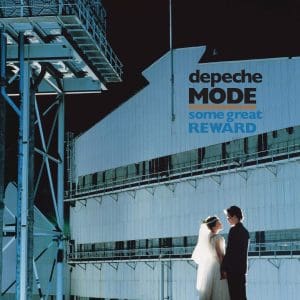
The album Some Great Reward visually connected with the band’s ongoing industrial interests with Brian Griffin’s photo session at a West Midlands industrial works.
“This part of the massive Round Oak Steelworks still exists in Brierley Hill,“ says Brian Griffin. “As a boy growing up in the Black Country, I could see the factory from my bedroom window.” The graphics of T&CP referenced these same industrial themes, with schematics and mechanical parts introduced as an integral part of the graphic identity.
Shaking the system
In 1985, Depeche Mode released two more singles, Shake The Disease and It’s Called A Heart. Musically, these tracks didn’t fit with the albums they preceded nor succeeded, and their sleeves proved equally unique.
Both featured more design work by T&CP, based around the kinetic figurative illustrations of Tamara Capellaro, chopped, cropped and torn in different ways across a variety of formats (just to join the pop dots, Capellaro attended art school with Neil Arthur, whose musical debut with Blancmange was also shared with Depeche Mode via the 1981 Some Bizzare compilation album).
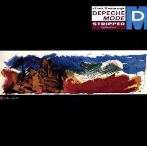
The single Stripped arrived in early 1986, dressed in black to trail the release of the album Black Celebration. In keeping with the album’s title and the darker themes of its contents, Depeche Mode’s sleeves began to adopt a distinctly more noir demeanour.
For Stripped, illustrator Ian Wright was given a minimal brief by Martyn Atkins for the cover art – “work in a narrow strip, and think about flags”. This would provide thematic clues as to the bold graphic style to come.
Black Celebration would be Brian Griffin’s last album cover for Depeche Mode, and its graphics embraced a more strident approach to design. Atkins and his team applied various lavish production techniques, including spot varnishing and debossing.
These production flourishes brought the moody graphics to life, adding subtlety to some bold visual statements. A series of icons were designed that were used widely across promotional materials and singles of the period.

It’s interesting in hindsight to observe the linear visual narrative that connects many Depeche Mode sleeves, and this would continue in 1987 with one symbol in particular – a ‘megaphone’ icon that had originally appeared on the sleeve of Stripped and which would soon become a defining symbol for the band on their next step to world domination.
Strangelove was released as a taster single for the album Music For The Masses and megaphones were suddenly everywhere, featuring on the album and its singles. T&CP had now established greater creative control and all of this period’s cover graphics and photography were credited to them, with Martyn Atkins also directing videos for two singles – Little 15 and Strangelove (Version 2).
Say it with flowers
In 1989 Depeche Mode released Violator, and the album and its first single Enjoy The Silence were linked visually with a floral theme borne from a creative collaboration between Anton Corbijn and Richard Smith at Area.
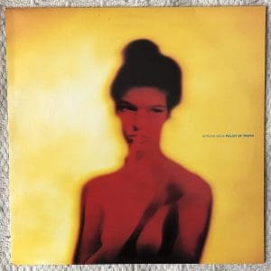
Between them they went on to explore a variety of disparate visual treatments for the Violator singles. This began with the block-coloured boldness of Personal Jesus through the performance art of World In My Eyes’ silhouettes via some blurry portraiture for Policy Of Truth.
“Prior to Policy Of Truth I’d worked with Anton on a catalogue for a fashion designer called Koji Tatsuno,” explains Richard Smith. “He’d just started shooting colour photography after years of black and white, and the imagery in that fashion catalogue utilised the same ‘painted light’ photo style as Policy Of Truth. The process exaggerated the film colour so you ended up with bright, super-saturated colours. World in My Eyes happened quickly. Anton shot some photos of the band around New York, I think, and that became the imagery for the sleeve.”
Read our Classic Album feature on Violator here
For Songs Of Faith And Devotion in 1993, Smith would attempt to bring some visual discipline to Corbijn’s painterly mark-making for the album. The darker, hand-rendered visual treatment reflected a band in transition, embracing more acoustic elements into their sound.
The sleeve designs from this period drew inspiration from many sources, most notably the bizarre birdpeople of Hieronymus Bosch, the early Netherlandish painter known for his Biblically-themed landscapes. Bosch frequently included fantastical micro-portraits of humans, animals, monsters and hybrid creatures into his works.
These nightmarish creatures featured in the video for Walking In My Shoes and also its single cover, which owe much to Bosch via fellow Dutchman Anton Corbijn.
The final single from the album was In Your Room, which and it was treated to some ingenious design for a special fold-out digipak edition.
When opened up, the packaging formed a crucifix, one side complete with an Anton Corbijn rendering of a crucifixion filling the space and running across the disc label… a lavish, if less than subtle sign-off to the whole Songs Of Faith And Devotion period.
Read our Classic Album on Songs Of Faith And Devotion here

Shooting from the hip
In 1997 Depeche Mode returned, slimmed down to a three-piece again, and design duties were once more taken on by Anton Corbijn and Richard Smith. Smith recalls the brief he received for the single Barrel Of A Gun: “Anton allowed me to do whatever I wanted with his photos, which I fully capitalised on. I was really into this fake handmade aesthetic at the time, using the computer to create a lo-fi, scrappy style, using scans of my handwriting and drawings.
“Anton mentioned something about how Dave Gahan fading away in the image was symbolic… I think because of what was going on with him personally. There was a lot of uncertainty about the future of the band at that time, and the sound on the single also had an aggressive edge that I think the sleeve design reflected.”
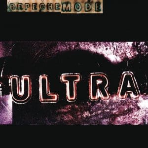
Smith was also granted artistic license by Anton Corbijn with the multi-layered sleeve designs that followed. “For the Ultra album cover, the lettering was made by projecting stencil letters onto photographic paper – it was a really interesting technique.
“There is an odd aesthetic for most of the singles from that campaign; Home, Useless and It’s No Good, they seem to go from the intense to the bizarre to the juvenile. For each single, Anton gave us all the pieces and we put the cover designs together from those.”
Between studio albums in 1998, Depeche Mode released a couple of compilation albums; The Singles 81>85 and 86>98. These collections spanned every album to date, so it was important that the design style have its own fresh identity.
The single that trailed the releases, Only When I Lose Myself, gave us a visual taste of what was to come from creative director Mat Cook and photographer Rick Guest. The photographs of grouped LED display units were the result of an epic 10-day photo shoot in various locations across the USA, selected to evoke previously explored environments for Depeche Mode.
The idea of using LEDs to spell out the DM initials and relevant dates is heroically simple, but its execution remains one of the band’s most audacious sleeve concepts to date.
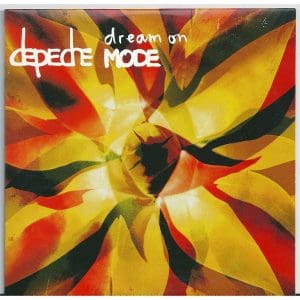
Dream On was released as a single in 2001, and its sleeve would again provide a heavy visual hint as to what we could expect for the album. Corbijn and the band selected organic elements as a theme, this time choosing an agave to use on the album’s cover.
Exciter and all its singles’ sleeves were created by Corbijn in collaboration with the design duo Form, and Form’s Paul West ended up working on the campaign for the Exciter world tour, including the merchandise.
“As I had worked with Anton on 101, he contacted us to work on the Exciter album and its singles Dream On, Freelove and I Feel Loved,” he explains. “While the band were rehearsing for their tour, up to five of us at times were working on the merchandise design – t-shirts, key fobs, badges, programmes, posters and adverts. With the records, Anton was very much the art director, and after discussions and rough visual approval he’d be happy to let us create the layout and develop the intricacies of the design using his hand-written logos and ‘title’ type.
“For me, the energy of the campaign comes from the sum total of all the parts. It’s always an interesting experience gauging the difference between collaborating with a new band and working for a supergroup like Depeche Mode.”
Finding the spirit
2005’s Playing The Angel album and its lead single Precious introduced fans to a new friend of the Depeche Mode family – Mr Feathers. This proved divisive with fans; some appreciated the humour, while others hated what they saw as the crude naïveté of a design that would package an album considered to be one of the band’s darkest.
It has even been suggested that the figure – created by Anton Corbijn from feathers and glue – bears a certain resemblance to The Cure’s Robert Smith. This period for Depeche Mode isn’t a design high point by any means, but it’s noteworthy that they were still willing to try something different this far into their career.
The same thing could be said of 2017’s Spirit album and its lead single Where’s The Revolution. Both sleeves again utilised Corbijn’s simplistic, lo-tech lettering and drawings. Sometimes, perhaps the music just needs to be left to speak for itself…

Looking back at Depeche Mode’s visual body of work, the variety is astounding. Today, themes from their studio albums are gradually being redesigned for the band’s career-spanning 12” single box sets, with each album’s cover image being sensitively reimagined by Ju Canon under the creative direction of Anna Bergfors at Intro, bringing new life to stories of old.
Check out Depeche Mode’s website here
Read more: The Lowdown – Depeche Mode
Classic Pop may earn commission from the links on this page, but we only feature products we think you will enjoy.