In our list of the best band logos we look at some of the most snazzy, most original and most memorable mastheads out there…
Logos are integral to the music industry. A good one, such as The Rolling Stones’ lips-and-tongue or The Beatles’ dropped ‘T’, are instantly recognisable. A bad one, meanwhile, may give off the wrong impression of the artist or band. In this list, we’ve collected together some of our absolute favourites. Have we missed anything? Let us know in the comments section at the bottom.
13 Scissor Sisters
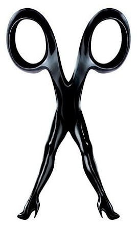
Designed by the band’s guitarist Scott ‘Babydaddy’ Hoffman in 2001, the Scissor Sisters logo is so brilliantly simple it could also be the masthead for a chic ladies’ hairdressers.
12 Public Image Ltd

Though it was photographer Dennis Morris who cooked up the finished logo, the idea of Public Image Ltd’s pill-type logo (PiL-type, geddit?) came from frontman John Lydon.
11 Jamiroquai
There’s no one else in pop with Jay Kay’s distinctive silhouette, so this self-designed logo, which debuted on Jamiroquai’s 1993 debut Emergency On Planet Earth, could never be confused with any other band.
Read more: Jamiroquai albums – the complete guide
10 a-ha
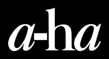
Elegant and simple, the italicisation of the lowercase ‘a’s in a-ha’s logo is instantly recognisable, so much so they’ve never felt the need to change it ever since it debuted on Hunting High And Low an amazing 37 years ago.
Read more: a-ha albums – the complete guide
9 Blur
![]()
All lowercase, no space, the Blur logo first appeared on Leisure in 1991 and has been used on virtually all their merchandise ever since.
Read more: Blur albums – the complete guide
8 Queen
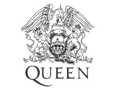
It was art school graduate Freddie Mercury himself who designed the suitably regal Queen crest.
7 Gorillaz
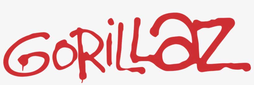 Of course Damon Albarn and Jamie Hewlett’s cartoon band would have a great logo – how could they not, with such a renowned comic book artist as one of their members?
6 Prince
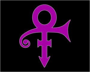
Prince’s symbol logo may not have stuck around for long, and indeed only come about as a fightback against Warner Bros, but, for a brief time, it was genius. “It is an unpronounceable symbol whose meaning has not been identified,” the singer wrote in a statement at the time. “It’s all about thinking in new ways, tuning in 2 a new free-quency.”
Read more: Making Prince’s 1999
5 Frankie Goes To Hollywood
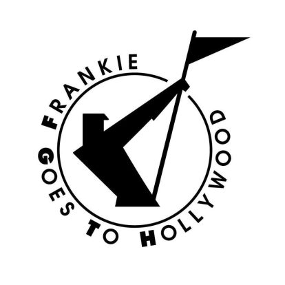
Designed by Dave Smart, the Frankie logo was inspired by, of all things, a German air filter advert from the 1920s.
Read more: Making Frankie’s Welcome To The Pleasuredome
4 Thompson Twins
![]()
Designer Andy Airfix cooked up this one, taking a photo of the three members’ heads and haircuts from the front cover of third album Quick Step & Side Kick, placing them in silhouette and glueing them together. Voila, an instant logo classic.
Read more: Tom Bailey interview
3 Public Enemy
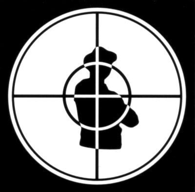
“The crosshairs logo symbolises the black man in America,” Public Enemy frontman Chuck D explained to Rolling Stone in 2014. “A lot of people thought it was a state trooper because of the hat, but the hat is one of the ones that Run-DMC wore. The B-Boy stance and the silhouette was more like the black man on the target.”
2 Sex Pistols
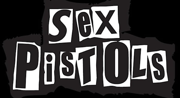
Created by Jamie Reid, the Sex Pistols logo is punk incarnate – scruffy, rebellious and with a DIY aesthetic.
1 ABBA
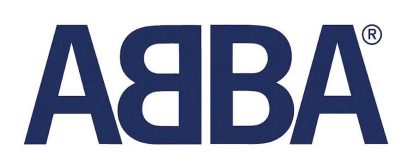
The iconic ABBA logo, with its backwards ‘B’, was created by Rune Söderqvist, a Swedish graphic artist who had previously worked in the advertising business. Instantly recognisable, its perfect symmetry has a classy elegance about it.
Read more: Top 40 ABBA songs
Classic Pop may earn commission from the links on this page, but we only feature products we think you will enjoy.