Pop Art – Duran Duran
By Classic Pop | June 3, 2021
Always ambitious, continually seeking to make a lasting statement, No band of their era understood the vital commercial alchemy between music and visual appeal better than Duran Duran. Not only did this lead to an unashamed fascination with the possibilities of fashion, but also to a four-decade catalogue of record design work that is as strikingly inventive as it is wildly diverse… By Andrew Dineley
Over the last 40 years, members of Duran Duran have worked with a wide range of creative talent on the design of their record covers. They rose to fame during a period in which design was crucially important; the way a pop package was assembled could help make or break new artists. Wisely, from day one, they established a routine of trusting some of the best with their design, and have remained engaged in the creative process to this day.
At the tail-end of the 70s, before the line-up of the band was settled and still without a record contract, Duran Duran were regulars on the live scene, particularly around the UK’s Birmingham scene. To promote these early appearances, they worked with a friend of the band, John Warwicker, on what would be their first artwork.
Warwicker, now an established graphic designer, explained: “It was during my stay in Birmingham that I met the early Duran Duran, before Simon and Andy had joined. I designed some of their early gig posters. At that point, I don’t think anyone had any idea of aesthetic direction in the intellectual sense, more an intuitive reaction to design – what was right or wrong was purely a matter of personal taste.
“I would’ve loved to have designed those first releases, but EMI quite wisely chose Malcolm Garrett. Malcolm’s design was executed perfectly for the context. His designs didn’t only reflect that moment in culture, they defined it. If I had designed something then, it would have been completely wrong… but my time would come.”
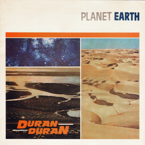
Garrett and his studio Assorted Images worked closely with Duran Duran from the time of their first single Planet Earth in 1981. Designers often seek to take inspiration from lyrics, and for the 12” version Garrett did his best to make patterns rhyme by juxtaposing single-colour stock imagery of natural terrains with a blurred image of the band.
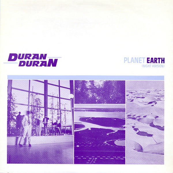
In contrast, the 7” version, this time reproduced in full colour, was devoid of any band photography – a defiant gesture for a debut released in a period when image was everything. All the same, this first single succeeded in setting out a design template that was both confident and restrained.
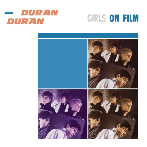
Duran Duran’s sleeve aesthetic stood out from the crowd in the early 80s. At a time when more was more and excess was celebrated, Garrett’s sleeve designs – simple boxes and blocks of colour set against minimalist white fields – seemed tasteful and sophisticated. Coupled with a series of bold Duran Duran logos that stylistically epitomised the modernist enthusiasm of the new decade, the follow-up singles Careless Memories and Girls On Film followed similar form, as did the self-titled album, albeit with some decadent debossing and metallic ink effects.
For the cover of the UK single My Own Way, a style was introduced that contrasted remarkably with what had been before – and what would follow – for Duran Duran.
Where there had once been white, there was now black; where there had been precise boxes we now saw roughly-rendered shapes, and all colour photography had now been replaced with linocuts using a restrained colour palette. Even the new band logo displayed no visual connection with their past. The sleeve’s bullfighting illustration was again inspired by lyrics from the song itself – “Now you’re on the sand lane everyday/ Dancing with the bulls in any old way…” Interestingly, for this design, Garrett collaborated with an old friend, Peter Saville, but the end result had little in common with anything either of them had previously produced. Saville, a respected record sleeve designer in his own right, had a connection with Garrett that went back a decade further to their shared student days at St Ambrose College in Greater Manchester. My Own Way would act as curious bridge between Duran Duran’s first two albums, and provided no musical or visual clues about what would follow next.
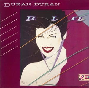
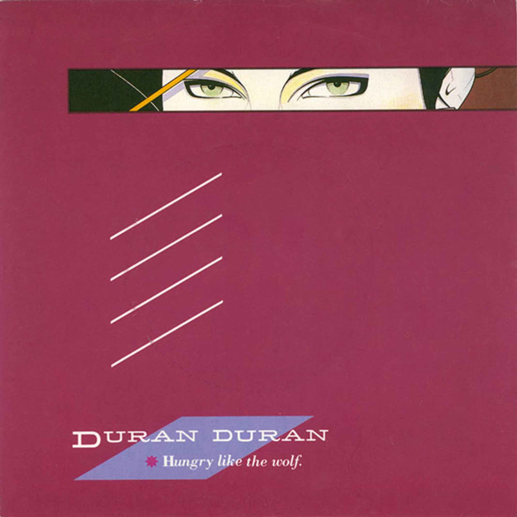
A week in advance of their sophomore album, Rio, Duran Duran released the single Hungry Like The Wolf. Its colourful, angular sleeve design offered a tantalising glimpse of the album to come. Garrett opted to ‘letterbox’ Patrick Nagel’s iconic illustration of Rio herself, the ice cream smile hidden away and reserved until the full reveal of the album’s cover. Nagel’s illustration was at the centre of Garrett’s wraparound album sleeve design, and the graphics complemented it perfectly. Nagel was an internationally renowned artist with work in galleries and publications worldwide. His portraits, predominantly of beautiful women, whilst at first appearing simple, were actually the result of working with photography: he would gradually remove the details, leaving behind only what was required to present a flat yet glamorous illustration.
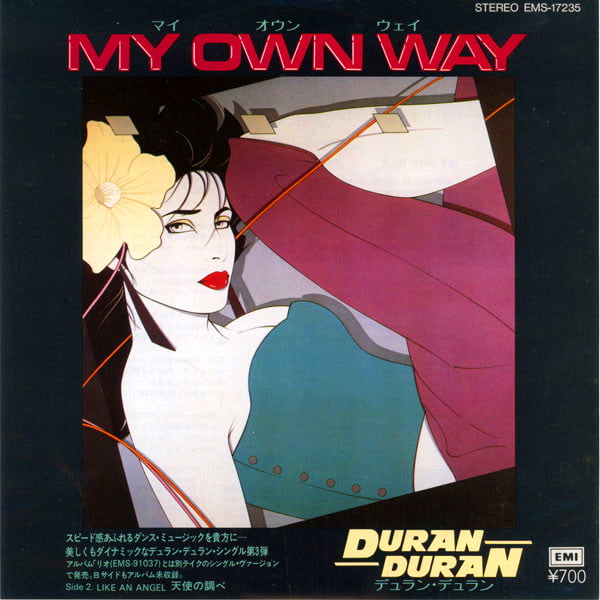
Duran Duran were fans of his work, as cited by Matthew Chojnacki in his book Put The Needle On The Record. “We had seen Nagel’s illustrations in Playboy magazine, and approached him off the back of that,” John Taylor recalled. “He did two designs for us and we chose the one [on the Rio cover]. Then the other one appeared out of the blue on the Japanese single release of My Own Way. No one had told the Japanese label that we hadn’t actually bought that one.”
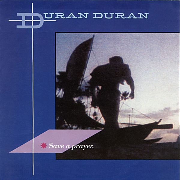
For the cover of the follow-up single, August 1982’s Save A Prayer, Garrett compositionally mirrored the album’s cover layout using a still from the Sri Lankan video shoot that bled off and wrapped around the sleeve. A slender crucifix was also incorporated into the design to reference the song’s title.
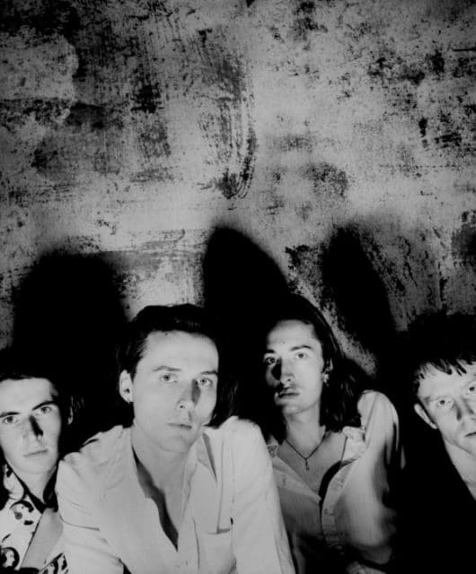
Duran Duran’s intriguing-titled third album was released as 1983 was drawing to a close. For the sleeve design Garrett teamed up with another old friend from his college days at St Ambrose, splitting design duties with Keith Breeden (then working with him at Assorted Images before going on to establish DKB, his own highly-successful design practice).
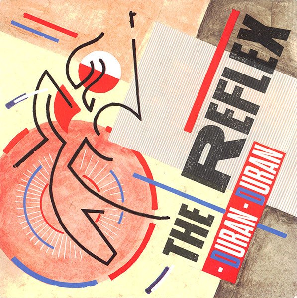
The album cover featured a glamorous shot of the band taken by Rebecca Blake on the steps of the State Library of New South Wales in Sydney, Australia. This image was set in an elaborate visual context, designed by Garrett and illustrated by Breeden. It thematically linked with the adventurous narrative seen in some of the album’s supporting videos. In an interesting evolution, this new ‘weathered’ aesthetic was also applied to the cover of The Reflex, where angular graphics were texturally executed using paint and pencils, with all guidelines and rough edges left exposed.
With the band now at the peak of their fame, it was only six months before a brand new single would appear. The Wild Boys was released with no less than six cover options; one for each band member, and one more of the full line-up. Alas, the single stalled just one place short of the UK No.1 spot, proving that beautiful design and shrewd marketing can’t guarantee a chart-topping single.
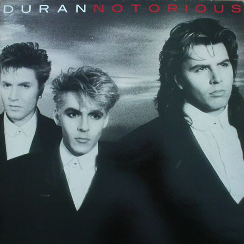
By the time Duran Duran arrived back after a break in 1986 with their Notorious album, they had effectively slimmed down to a trio. The moody cover image, captured by photographer John Swannell, was paired with a shot of supermodel Christy Turlington on the reverse. The band’s new line-up and sound called for a fresh visual outlook, and this was implemented by Frank Olinsky at Manhattan Design. His involvement came about through work with John and Andy Taylor’s side project The Power Station, where he’d developed graphics largely using red, black and white. Olinsky applied this same reduced colour palette to the Notorious album and its singles. The typography was rendered in a style reminiscent to that used on the sleeve of Parade by Prince and the Revolution, released earlier that same year.
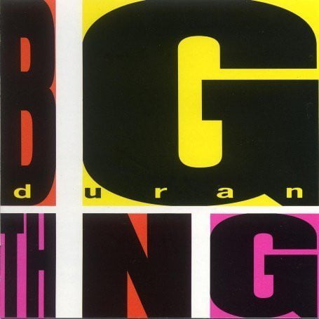
In 1988, Duran Duran released Big Thing. Hans Arnold, the sleeve’s Swiss designer, was rather better-known as an artist and illustrator than a designer, but his use of early computer graphics certainly suited the album’s brazen title. The lead single, I Don’t Want Your Love, trailed the album’s release by a month, and initially it appeared that design cues were coming from a style seen on the Notorious-era singles, with a predominant use of typography rendered in red, white and black. Thankfully, the follow-up singles All She Wants Is and Do You Believe In Shame? saw a return to full colour, resulting in some of Duran’s most garish designs to date.
Hans Arnold’s duties also extended to working on the sleeve design and layout of 1989’s compilation album, Decade. For this, he explored pop art further, placing collaged images created by fashion designer and artist Stephen Sprouse at the centre of the work. Sprouse, a friend of Andy Warhol’s, chose to render the band in true pop art fashion. Nick Rhodes is found resembling his hero Warhol on the front cover, while Le Bon is seen clutching an unavoidably phallic-looking rocket as John Taylor nonchalantly stares on. The whole image is displayed against a tin foil background – possibly another reference to Warhol, whose infamous Factory studio was decorated with the reflective material.

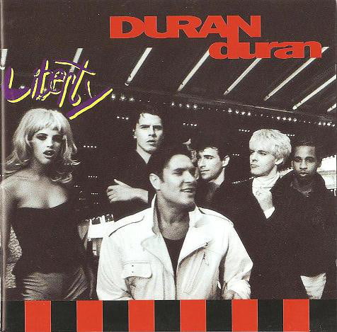
By 1990’s Liberty, Duran Duran appeared in full pin-up mode once again across the album’s sleeve. Former fashion model and renowned photographer Ellen Von Unwerth was the woman behind the images (she also shot many other iconic sleeves, including albums by Kylie, Annie Lennox and Janet Jackson).
The typography inside the album, meanwhile, was the work of lettering artist Ruth Rowland, whose hand-rendered wording can be seen throughout the CD’s booklet. “I have a vivid memory of sitting at a drawing board in Icon Design’s London studio, talking to Simon Le Bon about lettering,” Rowland explains. “The brush lettering on the Liberty album is deliberately unrestrained and energetic to complement the bright, dynamic imagery.
I worked much larger than it’s reproduced on the sleeve to try to keep the style casual – something that’s a lot more difficult than you’d imagine. Looking back at the album, I feel it perfectly captures a moment in time. I still enjoy that irreverent, raw quality and the way the words move across the sleeve.”
Duran Duran returned with a vengeance at the start of 1993 with their seventh studio album. It would project them back into the charts with singles that remain firm favourites today and a series of bold designs. The sleeve – by Nick Egan with Eric Roinestad – featured a solitary gold Duran Duran logo over a selection of sepia-toned wedding photos of each band member’s parents, a choice which gained the record its nickname of ‘The Wedding Album’ to avoid eponymous confusion. Inside and across its single releases, the design was left to run rampant with an aesthetic that could be read as a DIY-style, punk-era fanzine pastiche. Like the music it packaged, the design seemed to reference a diversity of influences; Jean-Michel Basquiat with its raw illustrative sketching, Warhol again with some overlaid print effects, also seen on the single cover for Too Much Information.
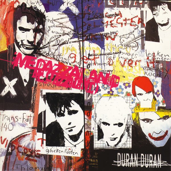
In 1997, Duran Duran released Medazzaland and handed over design responsibilities for the album’s sleeve to Andrew Day, fresh from Central Saint Martins School of Art and Design.
Day explains: “There’s a lot of good feeling around the album nowadays, and whilst the cover was perhaps a shock to the system, to many fans back in 1997, it’s mellowed since.
“I had just graduated from Central St. Martins, and certainly felt the pressure given Duran had worked with likes of Ellen von Unwerth, Stephen Sprouse, Malcolm Garrett, Nick Egan and Eric Roinestad. In a sense, I didn’t feel ready, but Nick Rhodes gave me the confidence.
“The painting on the front cover was constantly changing. Whilst the guys were in the studio, I would go in and sit with them, trying not to get in the way, sketching and writing down thing’s they’d talk about. I’d take Polaroids of their equipment and some of the stuff they’d surround themselves with whilst making the album. Then I’d go back home to my parents and do some more work on the paintings.
“John Taylor left the band whilst they were making Medazzaland. That was a huge blow. Then Simon lost one of his closest friends with the death of Michael Hutchence. It was a dark period for the group.
“Amidst all this, it seemed to me as though Duran Duran were looking for their own meaning and relevance whilst the UK was in love with Britpop and the Spice Girls, and the sounds of Nirvana’ and Pearl Jam shook the US.
“The painting on the front cover is a response to this – it’s raw, unfinished and in disarray. It’s a portrait of Duran Duran at that particular moment in time, and in their career as musicians who once conquered the world.
“The back cover is a reflection of the guys not wanting to be a ‘catalogue’ band. In the song Undergoing Treatment Simon sings about being “resigned to the mid-price section”. Copying and defacing Patrick Nagel’s iconic Rio illustration was my response to that – what did Duran Duran mean in the late 90s?
“I remember in the production department at Virgin Records, Stanley Donwood’s artwork for Radiohead’s OK Computer was on another screen and also being prepared for print. Tex, the guy who was artworking Medazzaland, clocked that the two looked visually related with their chaotic style. It was a happy coincidence!”

In 2004 Duran Duran returned to their ‘famous five’ line-up once again. With all original members back on board, Astronaut promised a lot. For the cover of the album and its hit single, (Reach Up For The) Sunrise, they went back to their roots, and John Warwicker finally got to create sleeve artwork for his old friends. There is a beautiful painterly quality to Astronaut’s cover art; it’s an impressionistic assemblage of the band, married with a new logo rendered in a suitably futuristic typeface, germane to the album’s title. Warwicker explains about how the ideas came together: “With some designs there are discussions about references to be made visible. At other times a design, as in the case of Astronaut, is generated by the feeling towards a situation and a response to something: in this case it was Kristian Schuller’s photographs. “Because of our history together, there’s been a trust and an openness. I really didn’t think of the ‘reunion’ so much, partly because this was how I’ve always known them… it was more a desire to show them at their best and to interpret the energy that seemed to be present at the time.
“Nick is always involved in the design, as is John Taylor. They had already chosen the photographer, so I art-directed the photo session and combined the photographs with graphics and typography.”

Confirming John Warwicker’s word on Nick Rhodes and John Taylor’s involvement with their own sleeve designs, 2007’s Red Carpet Massacre album credits Taylor as Art Director and Rhodes as cover photographer. With the design help of Patty Palazzo and additional photography by Kristin Burns, the end result may not be among the band’s best, but it does demonstrate a willingness to try something different.
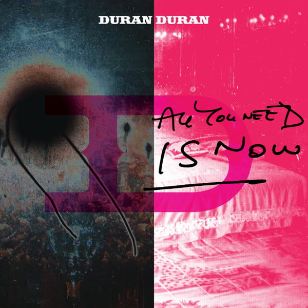
As 2010 came to a close, All You Need Is Now, Duran Duran’s 13th studio album, was partly released digitally shortly in advance of its fuller physical format. It featured the artwork of Clunie Reid with design assistance from Rory McCartney. Producer Mark Ronson famously wanted to make a follow-up to Rio, but the only visual hint of any such connection is perhaps the flash of cerise and a bold letter ‘D’ – updated, yet still reminiscent of their old logo. Ronson’s undying admiration for Rio had been underlined earlier that year when the artwork for his own album, Record Collection, included an homage in the form of Ronson himself partially rendered in classic Patrick Nagel style.
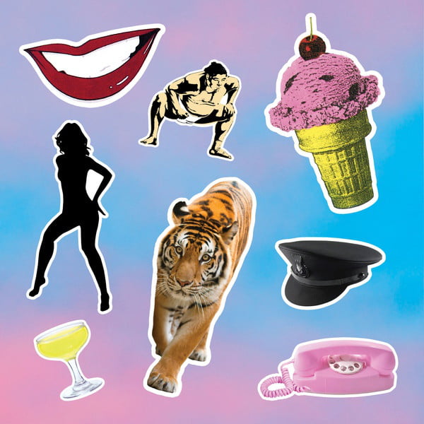
Half a decade would pass before Duran fans were presented with a new album, but 2015’s Paper Gods duly arrived in immaculate packaging. The original plan was to ask a number of different artists to generate sleeve designs that could potentially form an art exhibition in its own right, but this proved too ambitious, so just one artist was commissioned.
Nick Rhodes was a fan of Alex Israel’s modern pop art, and it was Israel that came up with the idea to use iconic images from the past – much like Warhol had done in his time. These images were then rendered as faux-stickers and placed against one of Israel’s signature ‘sky’ paintings. The final design became a work of art in itself in the form of a vinyl boxset in an edition of just 350; inside, amongst the vinyl, a signed certificate of authenticity and a number of reflective art prints, was a set of 16 stickers that one could affix to the outer case to create a unique version of the sleeve. It’s doubtful that many did risk this manoeuvre, and this remains a highly coveted item in the Duran Duran canon of collectibles.