For this feature on the best Pet Shop Boys cover art, we’ve selected key examples of design excellence from the duo’s remarkable oeuvre… By Andrew Dineley
Pic by Cindy Palmano
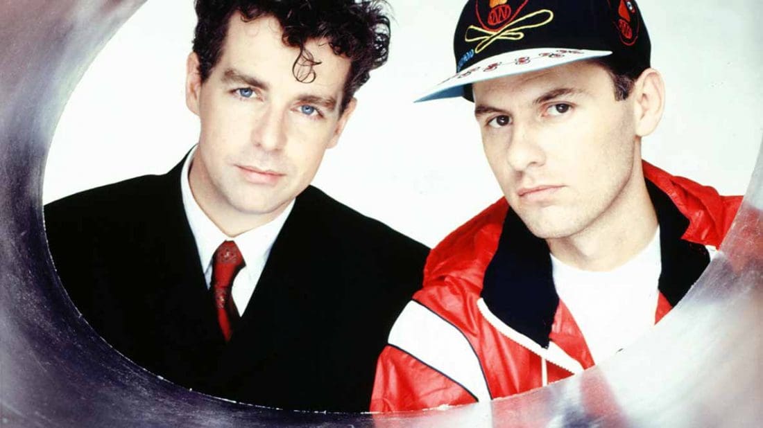
With backgrounds respectively in magazine publishing and architecture, it’s no surprise that a keen eye for visual detail would permeate everything for Tennant and Lowe.
Combine this with their early association with Tom Watkins as manager, a man who himself had an impressive creative pedigree working with Terence Conran before establishing XL design studio in 1982, and we can see how things inevitably came to be…
Pet Shop Boys arrived during a period in pop that saw a massive expansion in formats. Never had so much been spread so widely. One single could be stretched out across numerous seven-inch and 12-inch discs, poster packs, limited edition boxes, cassette singles and picture discs.
It was a ripe period for creativity. A cynic may look back and speculate that it was all about rampant marketing and consumer exploitation, but music fans duly lapped it up… and nobody forced this writer into buying anything.
In their 2006 book, an overview of Pet Shop Boys design entitled Catalogue, Neil Tennant confirmed their formative intentions. “West End Girls became a hit so slowly that there were endless formats to jig the charts,” he said. “Chris and I were influenced by Scritti Politti – the idea of looking like a brand, a perfume bottle or whatever.”
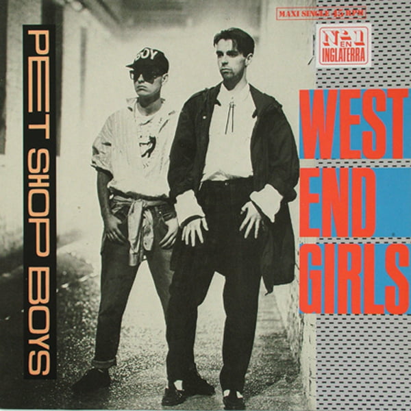
After a couple of false starts, West End Girls became Pet Shop Boys’ breakthrough single in 1985, heralding a sustained creative collaboration with Mark Farrow. His first PSB design was a re-working of the first single sleeve, which Chris Lowe himself had originally worked on.
Pet Shop Boys Cover Art – West End Girls
In his autobiography, aptly titled Let’s Make Lots Of Money, Tom Watkins provided an interesting perspective on this radical redesign by Farrow; “He loathed and detested the sleeve for West End Girls. He hated everything: the design; the lettering; the feel. Christ, I thought, this man takes record covers very seriously.”
Watkins, Tennant and Lowe were admirers of Ettore Sottsass’ Memphis Group in Milan, whose designs were recognisable by their bright colours and angular, pop-art-deco sensibility, and it comes as no surprise to see how Farrow had ticked the right boxes with his reductive re-interpretation for the West End Girls remix.
According to Watkins, “It was frankly a work of art. All excess imagery and uneven lettering was removed and he added bold blocks of red and blue, with a yellow circle at the centre like a record label.
Neil Tennant had apparently cried with admiration and jealousy when he saw the sleeve to New Order’s Blue Monday. He must have been a blubbering wreck when he saw his own sleeve… from that moment on, Mark Farrow was a vital part of the team.”
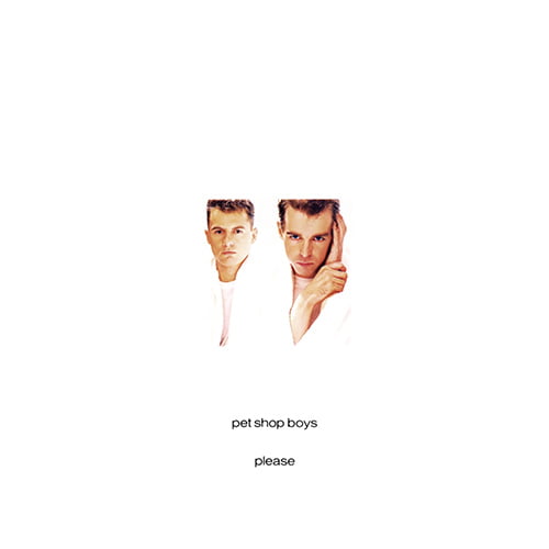
Within a few months, Please, Pet Shop Boys’ debut album, was released. Its simple one-word title would set a trend in 1985 for every other album they would release. The album sleeve followed a similar minimalist ideal, with Farrow further channelling the reductive graphic style he’d grown up with as a designer for Factory Records, prior to XL.
The front cover’s tiny lone photograph offset an inside sleeve featuring a grid of images, devoid of typography. In total, the image count ended up just one shot short of 100. For an exercise in restrained minimalism, that is a lot of photography, and all were largely taken by long-time collaborator Eric Watson.
Pet Shop Boys Cover Art – Please
“We were creating images that were intentionally un-pop – some imagery around the first album, for instance, was quite bleak,” said Tennant. “It’s mostly black-and-white. We wanted, and still want, to look totally different to everyone else. At the very beginning, we put out this manifesto to accompany our demo tape that listed all the things we didn’t want to be.”
Mark Farrow’s main objective was to create a sleeve that didn’t look like a record cover. Please couldn’t have been more different to its hyper-saturated chart competition and stood out for being the antithesis of sleeve design during the 80s.
Tom Watkins, however, originally had far more complex ideas. “I thought my concept was a great idea: a big fold-out lattice-work cover, opening out into a crucifix that contained all the mean and moody images they had created over the last couple of years.
“I excitedly folded the cardboard out in front of them, knowing they were going to just love it. An awkward silence ensued. Neil and Chris mumbled a few words with an overwhelming air of indifference. Perturbed looks flashed across their faces. They didn’t like it. I didn’t show it but I was mortified.”
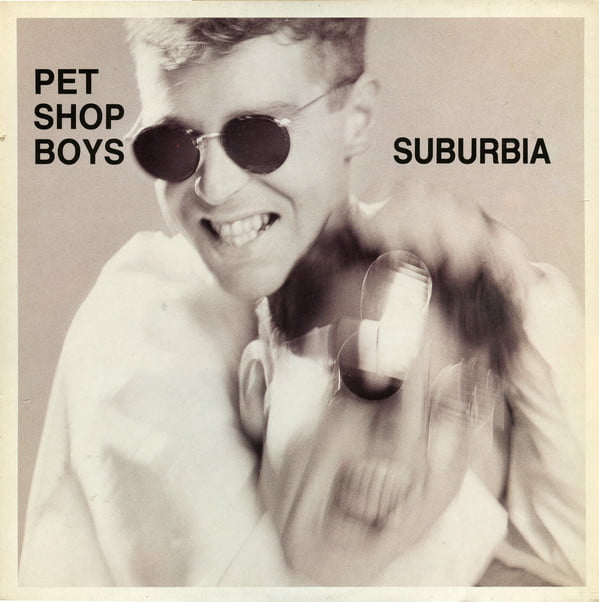
Sometimes images that will go on to define an act can come about in unexpected ways. This was the case for the single sleeve of Suburbia.
“I’d just bought this striped shirt and striped glasses and so I thought ‘Wow! This is visually stunning!’” said Lowe. “Neil just wore a plain T-shirt and plain glasses so it was obvious that it was going to work as a photo – me all stripes and him all plain.”
Pet Shop Boys Cover Art – Suburbia
Elaborating on the use of Eric Watson’s photographs for the single sleeve in the Pet Shop Boys book Catalogue, Mark Farrow concurred. “I’ve always thought that if the photograph is strong enough to do the work on its own then I don’t really need to do anything. In my mind at that time Chris was the logo, if you like.”
Though the front cover did bravely eschew any distracting words, typography was used on the back cover, laid out in a visual homage to movie credits, appropriate given that the single’s name was taken from a film. As simple as it may appear, this sleeve design was the first to earn Farrow a silver D&AD award.
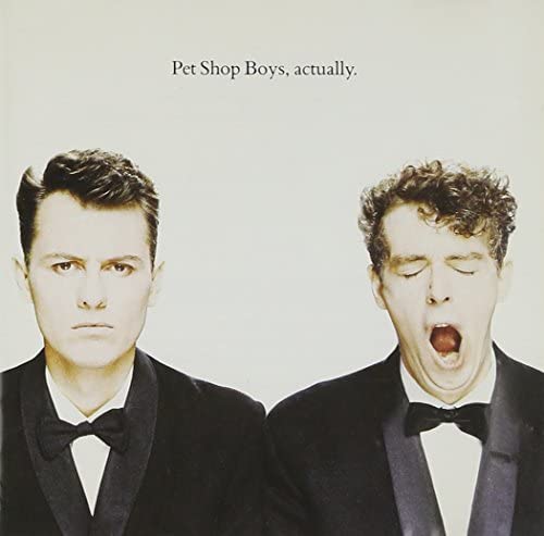
In contrast to the white space and minimalist cover imagery of Please, it was decided that a different treatment was required for 1987’s follow-up album, Actually. Neil Tennant came up with the idea of commissioning Alison Watt, the Glaswegian winner of the National Portrait Award, to create an oil painting of the duo for the cover.
Tennant, Lowe, Farrow and Watson headed off to Scotland to see the artist and plan how it would look, but practicalities were part of why the sleeve ended up quite different.
“Alison wanted them to sit for three weeks but their schedule made that impossible,” explained Tom Watkins. “She worked from a photo instead, but it looked quaint, stuffy and just un-pop.”
Pet Shop Boys Cover Art – Actually
Eric Watson had supplied a series of photographs for Watt to use as reference material, which led to much to-ing and fro-ing between the painter and PSB camp, but the idea was eventually abandoned, partly because Chris Lowe was unhappy with how he looked. “My face was all wonky,” he complained in the Annually book, published in 1988.
The final sleeve design went on to become a much-loved and parodied design classic, and remains a favourite of Neil’s.
“We liked it because it wasn’t a cop-out ‘please, please, buy me’ photo. It was sort of uncompromising and funny at the same time. It fitted all the basic tenets – it looked really strong, it was noticeable in the shops, it was funny and of course people were obviously going to say ‘Why are you yawning?’”
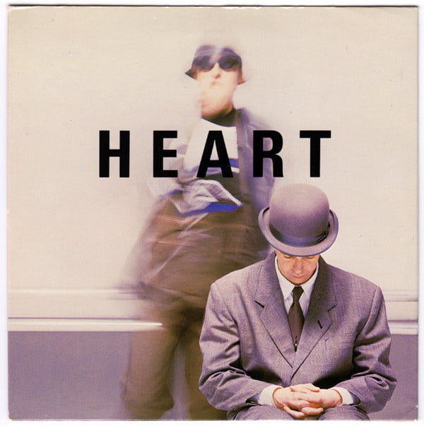
The sleeve of Heart, the last single to be taken from the album, is also classic Pet Shop Boys. The single had two covers, so buyers had to choose between ‘Neil’ and ‘Chris’, or simply decide to buy both – which can’t have done any harm getting the song to No. 1 in the UK.
Images from this session were also used on the cover of their 1988 book Annually, combined to visually reference the sleeve of Actually. The sleeve featured the duo in outfits worn at the UK BPI Awards.
“We do awards if they give us an award,” Neil – ever the aesthete – commented at the time. “If we don’t get an award, we don’t do it. They’re bollocks basically. My main argument against the BPI Awards is the hideousness of the logo.”
Pet Shop Boys Cover Art – Heart
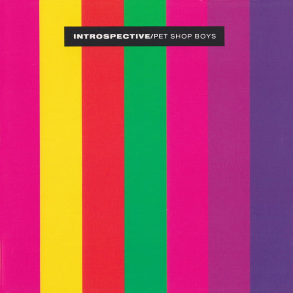
The sleeve of Introspective may not be a favourite of the duo, but it stood out on record store shelves at the end of 1988 and remains timeless in its simplicity. Each format of the release used a different combination of vibrant coloured stripes.
Manager Tom Watkins reportedly joked that subliminally, people would feel compelled to buy a copy of the album every time they saw the testcard on TV. The album contained just six tracks and in 1988 became their top-selling album, so perhaps the ever-shrewd Mr Watkins was on to something.
Pet Shop Boys Cover Art – Introspective
“I quite often look through our records and think how fantastic they look,” summarised Tennant. “You want to make the record something special. It’s not just nothing, the sleeve. I personally think it’s as important as the music. You’re buying an object, so you want it to be a beautiful object.”
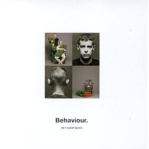
Introspective’s follow-up in 1990, entitled Behaviour, saw a return to form in terms of minimal design, if not sound. White space was back, making a perfect complement to some of the album’s sombre lyrical themes.
The flowers in the cover photographs may seem to reference mortality but later sleeve booklet notes surprisingly reveal the intention was quite otherwise, according to Neil Tennant.
“We had this idea with the roses because we’d been to Liza Minnelli’s apartment in New York,” he said. “She had this fantastic photograph, I think by Richard Avedon, of Judy Garland as a tramp holding a bunch of red roses. So we just nicked the idea.” In contrast to the album’s whiteness, hidden away inside Behaviour’s original vinyl release was a wonderfully indulgent exercise in design decadence and detail – a sleeve lined in deep rose red.
Pet Shop Boys Cover Art – Behaviour
In 1991, Was It Worth It? was released. By this point, Tennant and Lowe had grown tired of appearing on their sleeves, so this single instead featured them as dolls, handmade by a fan in Japan.
“We thought they were really fantastic and we said at the time that they’d make a great sleeve. They seemed to capture something about us. All the drawings they do of you in Japan always present you in this same strange way, with big eyes, and we’ve always liked that.”
The caricatures showed the duo with bunches of flowers, an homage to the photographs used on the sleeve of Behaviour the previous year.
For the two singles that trailed the 1993 album Very, Pet Shop Boys were transformed in a couple of other-worldly ways. For Can You Forgive Her? they wore orange suits with matching striped cone hats.
For the follow-up single, Go West, they appeared in blue and yellow uniforms with matching dome helmets. In 1993, with the pop chart saturated with Britpop mundanity, none of their looks could exactly be considered typical attire.
For the packaging of Go West these images were reproduced in red, white and blue and presented in a brash promotional style, the kind of thing commonly associated with US presidential campaigns.
It was a bold statement that was playfully extended to the promotional materials for the single, which included campaign badges and stickers.
The album Very was an extravagant affair in every respect – the costumes, promotional videos, packaging and live presentation all pushed creative boundaries in 1993.
For the album’s sleeve design, the duo had grown tired of the standard CD format and wanted to completely rethink the packaging concept. “We thought it was pathetic that, because of CDs, record design has just become a booklet behind a piece of transparent plastic,” they commented.
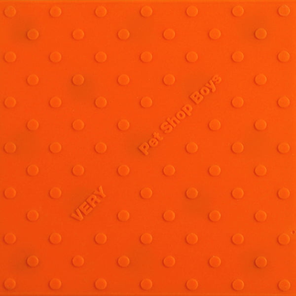
Pet Shop Boys Cover Art – Very
The duo gave Daniel Weil from Pentagram the audacious task of coming up with something unique. He delivered about a dozen viable concepts, two of which were chosen – one for initial quantities of the standard CD and another for Very Relentless, the limited edition double-pack.
Mark Farrow worked with Daniel Weil’s textural packaging to devise some pop art-style graphics for the album, mainly consisting of the duo wearing their Go West costumes.
These images also featured on a limited edition of 500 highly collectible Relentless DJ promo sets, pressed onto magenta, cyan and yellow vinyl with matching outer sleeves.
In 2002, Pet Shop Boys once again did something unexpected: for the first time in their career, they went to a different design company to work on the sleeve graphics for their next album, Release.
Visionaire in the USA came up with a design solution that built on Tennant and Lowe’s continuing desire to explore imaginative alternatives to the normal CD package.
Read more: Making Pet Shop Boys’ Behaviour
Read more: Top 40 Pet Shop Boys singles
The case’s text was printed in white onto a solid white case, which was then enclosed within a foiled slipcase – an elegant end result that went on to be nominated for a Grammy award. In the UK, four different coloured variants were available, each featuring a different debossed image of a single flower in bloom.
The cover subject was germane to the album’s title, which was suggested by photographer and collaborator Wolfgang Tillmans. Some rejected titles for the album included Whatever, Lovely, Tragic, Transition, Touché, Position and Home.
In 2003, Pet Shop Boys released Miracles, a single that trailed the release of their PopArt greatest hits collection. The album cover’s bold typographic design referenced a couple of iconic moments in Pet Shop Boys design history – Chris Lowe’s Issey Miyake sunglasses from Suburbia, and orange stripes lifted from the pointy hats of Can You Forgive Her?
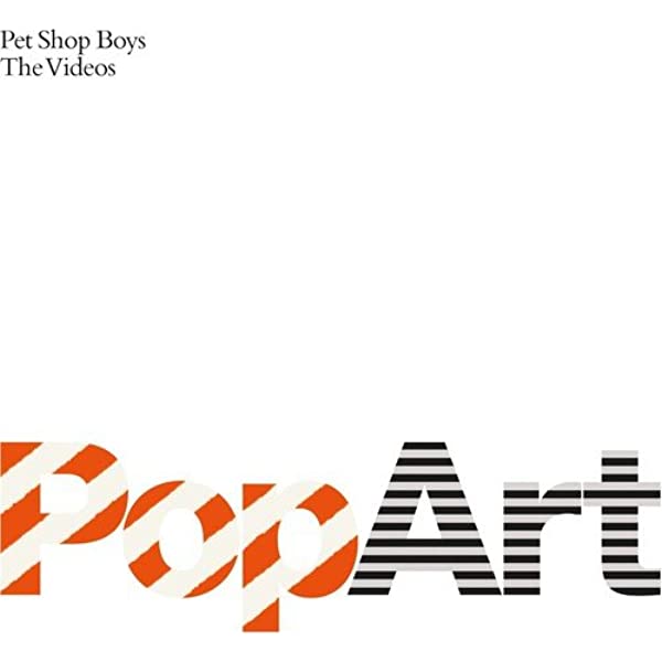
Pet Shop Boys Cover Art – PopArt
Despite reaching the Top 10 in the UK singles chart, Miracles is an often-overlooked track that’s rarely played live. It’s a shame, as the song and its sleeve design are both high points for the duo.
Essentially a love song, Miracles’ lyrics refer to the wonders of nature, and this is what inspired Farrow’s idea to elegantly combine silhouettes of Tennant and Lowe with images of cherry blossom.
“We really wanted the sleeve to be perfumed, as the promo versions had been, but by the time we had printed blossom onto every single surface inside and out, die-cut silhouettes of Neil and Chris into the cover and pressed the record on white vinyl, EMI finally applied the brakes,” Mark Farrow reported philosophically. “Well, if you don’t ask, you don’t get…”
In 2009, Pet Shop Boys released one of their most ‘poppy’ albums to date, entitled Yes. In some ways, this album’s sleeve may appear to reference that of their debut album, Please. Both rely heavily on squares, but on this occasion, inspired by Gerhard Richter’s 4900 art exhibition, colour was introduced and the concept was turned on its side.
“Although the Richter paintings look stunning on a gallery wall, as an idea for a CD cover it felt a little tired and we felt we had ‘been there’,” said Farrow.
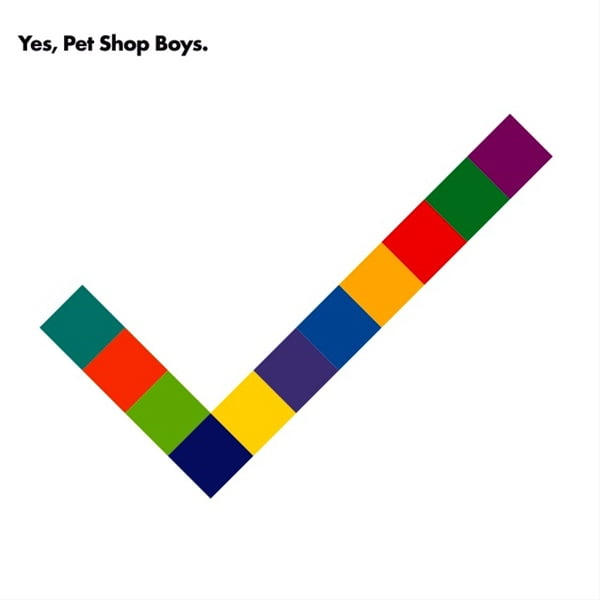
Pet Shop Boys Cover Art – Yes
The ‘square’ theme was also extended and adapted for use on the album’s singles, and was imaginatively brought to life by acclaimed creative director and set designer Es Devlin for the supporting Pandemonium live tour.
During these performances, everyone on stage at various points wore coloured cubes as headgear or had them incorporated into the various costumes. On top of that, Chris Lowe’s keyboard set-up strongly resembled a luminescent version of a Richter artwork.
For Pet Shop Boys’ 13th album, Super, released in 2016, the coloured squares of Yes were upstaged by circles, and the minimalism advanced further with the exclusion of even a band name on the packaging. A wider palette of vibrant colours was implemented across the various formats for CD, vinyl and streaming services.
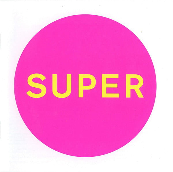
Pet Shop Boys Cover Art – Super
“In our initial conversations with Neil Tennant and Chris Lowe they described the album as being brash, pop and perhaps a little ‘unhinged’,” Farrow Design’s Gary Stilwell explained in an interview with Creative Review magazine. “They also suggested a few titles, and we all agreed that Super was the strongest.
“The simple brief was to encapsulate all these reference points in a single image. We quickly decided the cover should not be photographic and began to investigate bold graphic patterns and typography. Gradually, we reduced and refined these until we were left with a single fluorescent circle that, to us, conveyed the idea of Super.”
Nearly four decades into their career Pet Shop Boys continue to surprise and delight a global fan base, and even if their next step is unknown, it’s highly likely that we’ll never have reason to accuse them of ever being boring.
Read more: Pet Shop Boys: Actually
Go to Pet Shop Boys’ official website
Read our article on the cover art of Depeche Mode
Classic Pop may earn commission from the links on this page, but we only feature products we think you will enjoy.

