Pop Art – Greg Jakobek
By Classic Pop | September 2, 2022
Greg Jakobek’s name may not be familiar, but his design work certainly will be. His graphics graced the record sleeves of some of some of the 80s biggest names, and in this exclusive interview we go inside the covers with the man himself… By Andrew Dineley
How did you get involved with design and was it always your intention to work in the field of sleeve art?
I studied graphic design at Middlesex Polytechnic in the early 80s and never really had any desire to get into record sleeve design specifically. I never really thought about it, but after I left and never managed to get a full-time dream job, I ended up freelancing all over the place, mainly for public relations companies and nothing to do with the music industry.
 Then, by chance, a friend asked her boss if she could use me to do some advertising artwork for WEA Records and they asked me to work on design there every now and again.
This eventually led to them advertising for a full-time in-house job and they asked if I could work there just until the right person came along. Three months later, they gave me the full-time role in their in-house art department.
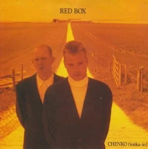
At first, I worked on promotional posters and advertising, then early on I remember working on converting album artwork to CD and cassette formats, I think Red Box was the first one I did.
I never quite got to the bottom of why the original designer couldn’t do it, but from this I ended up working on the singles from the album, the first one was Chenko (Tenka-Io).
Many years later, Red Box’s lead singer, Simon Toulson-Clarke asked me back again to work on another album sleeve for him, which was nice.
 The first design I recall seeing your name attached to was an 80s-style, Mondrian-esque cover design for Sophie and Peter Johnston. This electronic duo promised to be the North East’s answer to Yazoo. What’s the story behind their criminally-ignored debut album’s sleeve design?
This was in 1987 and it was one of the first album covers I designed. I had gone on the shoot with photographer, Andrew Catlin, who I would work with again later on.
It was a very low-key shoot walking around East London. We had some lunch in a fish and chip shop, which is where I saw the yellow and green formica on the counter. So it’s more fish and chips than Mondrian really!
Within a year of this you were starting to gather some bigger name pop clients. How much creative freedom were you given and what were your inspirations as an up-and-coming sleeve designer?
They weren’t really clients as I was still working in-house at WEA and creative freedom is not a phrase I seem to recall in those days. To be honest, it was more often a case of being told – “this is the photograph, make sure the type is big and at the top!”
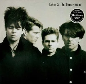 Around this time, you established a working relationship with Echo & The Bunnymen, designing several sleeves for the band, often based around using Anton Corbijn’s remarkable photography.
I was still working in-house when I got the Bunnymen project. I remember being asked to step into my boss’ office. She said she wanted me to work on an album for a band called Echo & The Bunnymen and being a huge fan from my college days, I was very excited.
My excitement was soon tempered when she produced the Anton Corbijn print and told me that was to be the front cover.
It ended up looking good but it was only with the singles that followed where I got more creative freedom. Singles were fun in those days, there were so many different formats to think about. I worked on The Game, Lips Like Sugar, People Are Strange, Bedbugs And Ballyhoo, plus the best of Ballyhoo album.
Of the Bunnymen sleeves, are there any that remain favourites of yours?
If I had to pick one, it would probably be Lips Like Sugar. The black and white sleeve design was based around some beautiful black and white individual portraits of the band, again taken by Catlin.
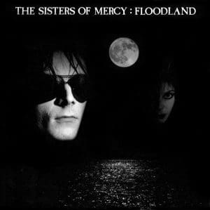 In 1987, The Sisters Of Mercy were just crossing over into the mainstream, and were another band you had a sustained creative partnership with. As with many of the sleeves you worked on, I notice that you don’t get a design credit. Why was this?
I worked on a few of their big singles including This Corrosion, Dominion and Lucretia My Reflection, along with the album, Floodland. The Sisters Of Mercy sleeves were generally light on credits, but the truth is that during my time at WEA Records, me and my colleague weren’t allowed to put a credit on.
Specially commissioned photographers or illustrators were credited and occasionally we would sneak the odd one on, but as a rule there were no credits allowed for the graphic design.
The Sisters Of Mercy’s lead singer, Andrew Eldritch was a perfectionist. He would always insist we used Letraset transfer lettering for the typeface, Caslon Antique. He insisted it was a better cut than from a typesetter, he was right but it was a pain. That was the last time I ever used it.
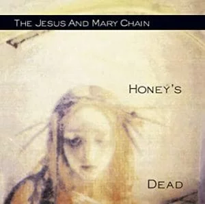 By the early 90s and your work for The Jesus And Mary Chain, graphic design was just transitioning into the digital realm, but your sleeves used some really nice hand rendering and degraded photographic treatments.
Their Honey’s Dead album and its three singles, Reverence, Far Gone And Out and Almost Gold were the last sleeves I designed for WEA and this was all pre-digital – they put the Apple Macs in the month after I left.
The image on the album cover was actually a distorted classical painting, colour photocopied out of a book and then enlarged a number of times to fit a wall in the studio.
I loved what Gerald Scarfe was doing, physically distorting Polaroids, so I then took a number of photos of the enlarged image on the wall.
The album was one of the cleaner ones, for the project’s single covers, I really mucked around, writing
on them quickly with my fingernail. I think I still have a stack of the originals somewhere.
You worked with Aztec Camera at their international commercial peak. Peter Saville and Nick Knight had worked on the Love album sleeve and you took over design duties for the four singles that came from it…
At that time, the record company were very keen to link the sleeves with the videos, so for some of them we took screengrabs from the promotional videos. Some of these were shot on film and that added a nice textural quality to the photographs we used on the four singles – Somewhere In My Heart, Deep & Wide & Tall, How Men Are and Working In A Goldmine.
 You continued to work with Aztec Camera on Dreamland and Frestonia.
I very much prefer the Frestonia cover, which was one of my first jobs after setting up Warsaw Design Studio. The cover image was shot by Gavin Evans and it came from a great photoshoot in the woods.
It was then that I started using a very fine weight of the Helvetica typeface, which I continued to use on Roddy Frame’s self-titled album, Surf. That sleeve featured a great city shot that looked like New York, but it was actually a hospital in South London.
By the mid-90s you were working a lot with George Michael. Many of his sleeve designs were based around images of the man himself, and speaking with other designers that designed sleeves for him – Simon Halfon and Rob O’Connor at Stylorouge, George was always also very involved in the creative process. Was this your experience?
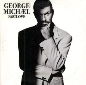 I started working with George on the 1996 single, Fastlove from his album, Older. At that time, I had moved my studio to his offices in Highgate, not only to work on his releases, but also for other artists he’d signed to his newly-formed record company called Aegean.
George really was very hands-on, especially at the beginning, but over the years he became less so.
I worked on a lot of singles for George, including Outside which was great. We sourced the photo from Magnum – we had a large selection of beautiful gritty photos of convicts and arrestees and we used a close crop of one of these for the Outside Mixes release.
Some people believed it was George but it wasn’t. There was an alternative idea of just having a shot of some Gucci silver handcuffs – yep, there is such a thing, but it didn’t look great.
One of my fondest memories was flying to the recording studio in New York when George was working on the Songs From The Last Century album.
The sleeve was designed on a laptop in the recording studio over a weekend, with George passing comments between vocals. We used some great photographs taken by Andrew MacPherson.
I’m also really proud of the design work for the Patience album and its singles, Flawless and Amazing from 2004.
- Read more: Pop Art – Duran Duran
- Read more: Pop Art –Vince Clarke
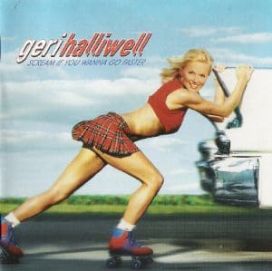
Around this same time, you worked with Geri Halliwell on her sophomore solo album and its singles. She was a hot property for EMI at this point. How was it working with an artist for whom so much was invested?
 Geri was managed at the time by George’s manager which is how I got the job. She was even more hands-on in the creative process than George was really. I always felt that my job was not to impose too much on an artist – they needed to be happy with the results.
With my history of working at a record company, I felt that record companies knew that I would understand their priorities without actually having to mention it, if that makes sense?
With Geri, the concept was based on the album’s title, Scream If You Wanna Go Faster, so a number of stunts were shot in Miami.
I couldn’t go on that shoot, which was a shame, though it was blessing in the end as Geri was photographed giving the record company guy a friendly hug and it ended up splashed all over the front page of the Daily Star.
The poor guy was oblivious to all this because of the time difference until he got a call from his boss… it could have been me!
The first single sleeves featured video grabs. The last single Calling was a lot more stylish as we used a shot from a session.
After this, it appears that you stopped working under the name of Warsaw and moved away from the pop music industry.
Yes, I moved into classical releases working with Plácido Domingo and José Carreras, to name just a couple. This was great as there were no egotistical artists to deal with but then I gradually dropped a lot of music industry work. I just wasn’t enjoying it anymore.
I needed a change in my life. I still do the odd bit of design work when approached and I have no regrets.
It was fun but I’ve moved on and now work in a completely different area with my own bespoke kitchen design company.
- Want more from Classic Pop magazine? Get a free digital issue when you sign up to our newsletter!