Inside the album art of 1984
By Classic Pop | February 14, 2024
How the album art of 1984 created a lasting legacy
In 1984 many artists chose to fuse pop and art on their record sleeves, with plenty opting out entirely from a cover appearance. Here we look at examples of who did it best and others who took a more traditional approach, all of which comprise key contributions to a lasting legacy of exemplary album cover creativity.
Words by Andrew Dineley
After a few years of synthetic sounds reigning supreme, 1984 could be seen as the year in which a substantial and tangible stylistic shift became apparent in the UK pop charts. Mechanical music, that had once sounded like the future, was now softening as synth-pop gave way to sophisti-pop and a whole crop of new acts emerged, some inspired musically and visually by decades previous.

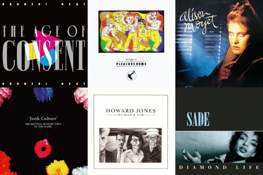
Sade’s debut album, Diamond Life, is a perfect visual representation of the time, ultra-modern, yet stylishly retro. “The designs I did for Sade were very influenced by the jazz sleeves of Reid Miles and Blue Note records,” says graphic designer Graham Smith. “All über-cool, classic, understated and sophisticated… It has a timeless, elegance and simplicity to it that summed up the style of Sade and the decade. It still looks the part today.”
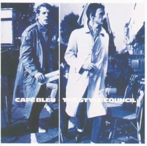
Parisian Style
The Style Council’s sleeve designer took design inspiration from similar sources, evident on the sleeve of Weller and Talbot’s Café Bleu album. “This was 1984, before the word paparazzi became part of our everyday language,” reflects Simon Halfon. “Back then the word evoked a glamorous, bygone era… It was the idea of a stolen moment that was the inspiration behind the album cover shoot. And it conveniently doubled up as a nice holiday in Paris for all of us.”
Expressionistic Artwork
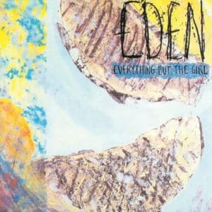
After brief spells as solo indie artists, Ben Watt and Tracey Thorn released Eden, their jazz-infused debut album as Everything But The Girl – a slogan taken from Turners, a furniture shop in Hull. Its sleeve art was created by Jane Fox, a former member of the Marine Girls, a band that Thorn herself had been part of. The three-dimensional, expressionistic artwork is a collage comprising hand-drawn and painted elements combined with torn paper, glued into place. Apparently, the duo’s label didn’t quite know what to do with the piece when presented with it, but it worked well for the duo’s first album.
Duotone Debut
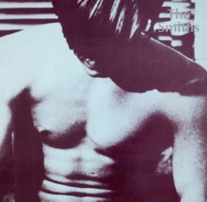
Fellow indie stars The Smiths released their self-titled debut album this same year, also choosing not to appear on its sleeve – an iconic visual statement implemented with prior singles and every subsequent release for the band until their 1987 demise. Their much anticipated debut featured a duotone image of actor and Andy Warhol protégé Joe Dallesandro on its front cover. The close crop was taken from Warhol’s art film Flesh, in which Dallesandro played a New York street hustler. The actor perhaps more famously also appeared on the sleeve of The Rolling Stones’ Sticky Fingers album, designed by Warhol, that featured the actor’s denim-clad crotch and derrière, again in close-up, for both sides of the sleeve.
Red Alert
As a new crop of artists appear, others fade away, and Soft Cell’s implosion was publicly on display with the release of their third studio album, This Last Night In Sodom. It was raw, more visceral, and had a bloody sleeve to match, created by Almond with friend and longtime cover designer, Huw Feather.
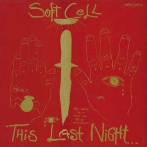
Early on, Almond had stated that he preferred working with people he knew and trusted. Says Almond: “We’d rather a friend did it than some faceless person in an office who has to churn out six a day: ‘Well, I’m doing Status Quo this morning, but I’lI try and fit Soft Cell in between Demis Roussos and Yes’. Later elaborating more specifically: “The album title was intended as an apocalyptic statement, to suggest that this was our final night of freedom before the impending catastrophe. God, in this case, was substituted by Thatcher. The cover artwork was a drawing by a psychotic, schizophrenic girl whose work I’d found in a textbook about insanity.”
“The simple, yet powerful images really spoke to us,” adds Huw Feather. “We were fascinated by tattoos and all that kind of imagery and were keen to come up with something that would cause intrigue. The colouring was intended to look like a bar of Bournville chocolate. I loved the contrast of those weird images with the sumptuous gold and red, it was designed to provoke a reaction. On the record racks next to other releases at the time it really stood out.”
Pink Triangle
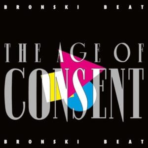
Marc Almond would go on to duet with Bronski Beat, a band who released their debut album, The Age Of Consent, in 1984. Its sleeve may be unfairly judged as formulaic 80s graphic design with its neon hues and angular shapes, but there is more behind its conception. The pink triangle, central to the image, was originally devised by the Nazis in World War II to identify homosexuals in concentration camps and was later appropriated as a symbol of gay pride, years before the LGBT+ rainbow.
It was a defiant and brave statement to make during a challenging political period for the gay community and a bold move for Bronski Beat who extended the idea inside the album with Bruce Gill at Green Ink design studio. “There were some issues with typesetting the inside sleeve of the album,” says Gill. “As well as the lyrics, we also listed ‘European laws regarding minimum age for lawful homosexual relationships between men’ with a telephone number for gay legal advice. One of the outside companies we commissioned for typesetting objected to the content and refused to do it!”

Best Dressed Sleeve
This year saw Frankie Goes To Hollywood conquer the album charts with their debut, Welcome To The Pleasuredome, an extravagant statement in every sense: the art, production, double format and hype. Its sleeve design was as impressive as it was unexpected.
For their first album they were rendered as cartoons by the illustrator Lo Cole for XL Design, the house design team for ZTT: “When I received the call inviting me to do the sleeve artwork for Welcome To The Pleasuredome, I was more than happy to accept – what a coup! A gatefold, fully illustrated double album for the number one band of the time. To my knowledge, I wasn’t pitching against anyone else and it was just me – my job to get right. I was initially briefed by Paul Morley whose concept for the album centred around Coleridge’s Kubla Khan poem. I remember meeting the band to do initial sketches and then having a week to provide roughs.
“At that time my work was influenced by Picasso’s line drawings and those of Jean Cocteau. All went well and I was a given a further week to produce the final artwork. Another week without sleep, several failed attempts, sore hands and the final pieces were ready to go to print. The album became the No.1 album of the year and I was particularly pleased to see it voted NME’s Best Dressed Sleeve of 1984.”
Pop Art
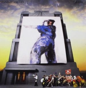
Spandau Ballet upped the visual ante with their fourth album, Parade. The eventual cover image was an elaborate combination of props, painting and a coterie of costumed friends, celebrities and family. “I wanted to return to making the record sleeve important,” says Gary Kemp. “So much has been done with videos, while the sleeve’s just been passed over, the record sleeve is an important part of an album. Unlike a promotional video, it’s something permanent, something you can keep…
“One of the original ideas for the sleeve was to recreate The Beatles’ Sgt. Pepper sleeve using people in the entertainment business, sport and politics who sum up the best of the 80s. But it was too short notice to get it together… When David Band and me get together to discuss new artwork ideas it’s never done like a meeting. We just go out and get smashed and come up with loads of ideas.”
The respect between the musical artist and sleeve artist was mutual. “I’d been working on a painting of a man holding a megaphone for the album sleeve when Gary came up with Parade,” says artist David Band. “That sparked off all the different images. It was good for me to get into painting with oils, rather than the felt pens of the True sleeves, and Parade gave me that opportunity because Gary’s into art as well. He’s really good to work with, because unlike a lot of people he’s interested in all the arts – not just music.”

Monochrome Set
The cover of Howard Jones’ debut album Human’s Lib could be seen as the antithesis of 80s excess with its monochromatic cover image and neo-classical restraint. Echoes of Peter Saville’s 1980 sleeve for Closer by Joy Division may be in evidence, but behind the enigmatic simplicity lies a deeper narrative. The three fictional characters shown with Howard in the cover illustration by Steg are Ruth, David and Dennis.
Jones is reported to have shared a complex tale around the time of the album’s release at at least one live concert, where he elaborated on the friends’ imaginary tangled lives. A tale that was said to involve marriage, betrayal, bus driving, complex affairs and misadventures spanning continents. Merchandise was even sold at early gigs in the form of a set of three individual button badges, each featuring the names of Ruth, David and Dennis.
Dreamlike Seascape
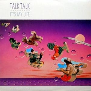
Conversely, some record sleeve concepts may at first appear to have deep meaning, only for the reality to be somewhat different. One such example of this is Talk Talk’s second album, It’s My Life, impeccably painted once again by the band’s longtime creative collaborator, James Marsh. In his book Spirit Of Talk Talk, Marsh elaborated on the cover image: “The decision to release It’s My Life was quite sudden, affording little time to produce a concept, let alone any artwork. Given only the title by way of information, I suggested an existing image I had that I thought might work in this particular context.
“The painting I presented was originally created for a wraparound hardback book jacket titled The Facts Of Life by Robert Nye, published by Hamish Hamilton the previous year. On the face of it, the underlying theme is the same, which is why it seemed so appropriate. The painted collage incorporates a pastiche section of a well-known painting, The Boyhood Of Raleigh by Millais, within the dreamlike seascape and floating puzzle pieces. Needless to say, they used it but it probably explains why this cover design looks slightly out of context alongside the other main albums.”
Talk Talk’s Mark Hollis never was a fan of appearing on his own record covers, explaining at the time: “We use illustrations because it says a lot more about the music than having us three on the front, smiling.”
Old School Style
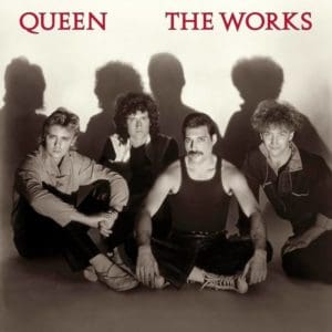
Getting the balance right for the creative talent behind the sleeve and those featured on it isn’t always easy. Bill Smith worked with Queen on concepts for their album The Works and remembers how the eventual design came together. “It’s not often you get to work with true superstars, so to get the chance to work with Queen was a pleasure,” Smith says. “I came up with quite a few visuals, some using band images, some using images that gave an idea of ‘works’. It was decided to use a shot taken by Hollywood photographer George Hurrell.
“He was ‘old school’ and had been shooting portraits and stills for big movie studios MGM and Warner Brothers since 1920… The front cover layout was fairly simple but I wanted to get ‘work’ into the cover somehow, so selected a photo of some cogs by a Russian Constructivist artist called Aleksandr Rodchenko. To me it was more representative of the title than the cover shot, which felt more like boy scouts sitting round a campfire.” The cogs did make it onto the back of the sleeve.
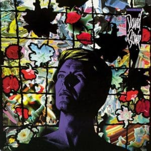
Romantic Hero
David Bowie is an artist that cared passionately about art and his own visual presentation. This included how his records were packaged. In 1984 he worked closely with sleeve designer Mick Haggerty on the cover of Tonight, inspired in part by Vladimir Tretchikoff’s Green Lady painting from 1952. “He talked about the mood of that painting, stories of the Holy Grail, about stained glass windows and the artist as Romantic Hero,” says Haggerty.
“He was the easiest and most interesting artist to work with. Playful, passionate and totally secure. I was already experimenting with my own makeshift image compositing system that I had built inside a closet at home, using a backlit vintage 8×10 camera. Before computers, there was no other way to make complex photo images, than to cut and paste together paper prints made from film negatives, using scissors and glue, and then retouch with paint. I could shift registration and easily paint and interfere with the image. It was laborious and slow, but the result looked nothing like the retouched images of the day.
“David and I met about a month later in New York, and I shot lots of Polaroids of him in his hotel room at The Carlyle. From those I made a graphite drawing, which I tinted Yves Klein blue. I shot traffic and lights around Times Square, and later flowers and oil paint smears in my studio and assembled it all in my closet. We were both quite amazed at the results I recall.”
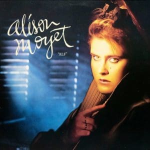
Not So Invisible
If a photograph is strong enough, it can effectively be the album sleeve, and part of the talent of a good designer is to know whether additional graphical elements are required, or is the image in itself enough to sell the package? Prior to being a solo artist, Alison Moyet hadn’t appeared on any of her record sleeves, so it was interesting to see her step from the shadows, almost, for her debut album, Alf, created with Rob O’Connor of Stylorouge.
“We were there almost from the start with Alison, she’d had one single and she didn’t like the cover,” he says. “She wanted something simpler, so we created a looser look with that hand-drawn logo. I worked with the photographer Simon Fowler on the cover of the first album. We created the look of a barn in the studio with some old film props and we lit it with blue lights and smoke.”
Industrial Experimentation
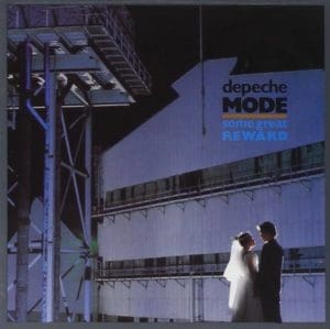
Moyet’s ex-label mates Depeche Mode were, in 1984, on their fourth album release in as many years and again opted to work with the late Brian Griffin, the photographer responsible for all of their previous albums. The sleeve of Some Great Reward, visually connected with the band’s ongoing industrial experimentation, evident in its photo session shot in a West Midlands industrial works that was familiar to the photographer.
“This part of the massive Round Oak Steelworks still exists in Brierley Hill,” says Griffin. “This factory I could see from my bedroom window growing up in the Black Country as a boy.” The graphics supplied by Martyn Atkins’ T&CP design studio naturally referenced the same industrial themes with schematics and mechanical parts introduced as an integral part of the complementary graphic identity.
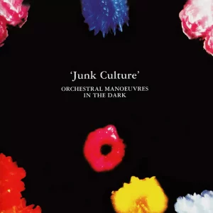
Floating Florals
Another prolific act that came to prominence at the dawn of the 1980s was also on a roll of yearly releases in 1984, and they too had a quality pedigree with their album art. Junk Culture was the fifth album by Orchestral Manoeuvres In The Dark and for this release, the band again entrusted the album’s art to Peter Saville. The sleeve appears to build upon the designer’s post-modernist floral interests, evident also in his concept for New Order’s Power, Corruption & Lies from one year earlier.
For OMD, Richard Haughton was commissioned to shoot vividly coloured floating flowers. Haughton’s work is largely portrait-based so this unusual commission is one he remembers 40 years on: “As I remember it was shot specifically for the cover and the soft focus/blur effect was something I came up with, pulling focus on the enlarger while exposing Cibachrome prints,” Haughton says. “Don’t think I ever did that again when I think about it – I’m surprised I remembered that instantly, not having thought about it at all since then, even though I like the sleeve a lot.”
From abstract to intimate and decadent to borderline demonic, this selection of 1984’s sleeve designs provide us with a fantastically imaginative body of work from a changing decade that has now reached its middle-age.
Classic Pop Presents a deep dive look into 1984
Read more: The story of 1983 in music