Pop Art – David Storey
By Classic Pop | September 8, 2022
 From obscure underground artists to worldwide pop legends, David Storey is the man behind more than 40 years worth of record sleeve design. We caught up with him at his studio in Hove to explore his portfolio… By Andrew Dineley
Your first record sleeves were for some high-profile releases, but where did your design journey begin?
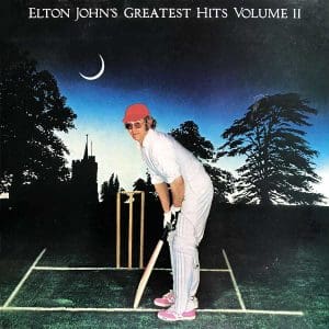
I got a job at Elton John’s Rocket Records when I left art college and the first LP I worked on was the second volume of his Greatest Hits.
I also did a couple of his singles before that including Don’t Go Breaking My Heart which went to No.1, so it was a wonderful way to kick off my career.
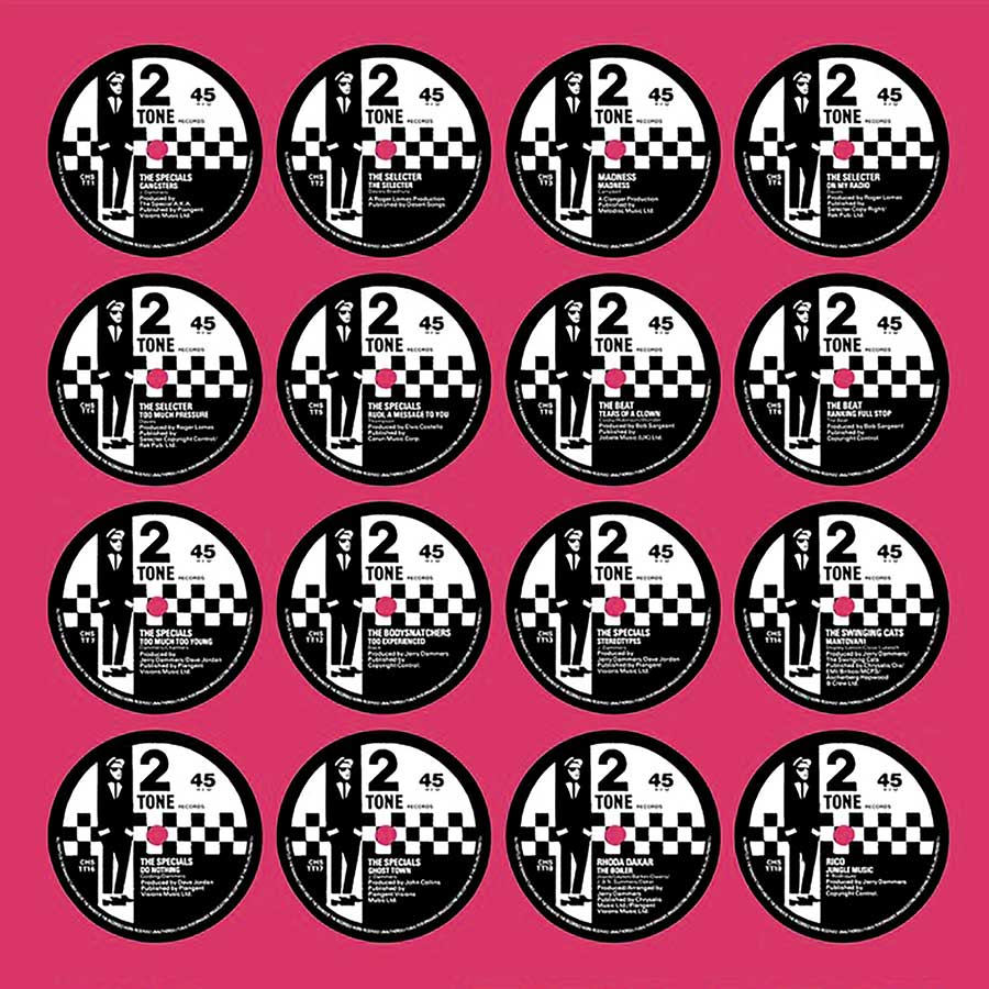
I was at Rocket for about nine months, which was a terrific stepping stone to get me into Chrysalis Records the following year – they signed The Specials and the 2 Tone label the week I started.
The art department was basically myself and my friend John ‘Teflon’ Sims. For the first 12 months we mostly worked on design for the 2 Tone artists – The Bodysnatchers Madness, The Beat, and others. It was a fantastically inspiring time to be involved.
The graphic identity for the 2 Tone label was very strong – the monochromatic design work and that iconic logo… How did it all come together?
 The ‘Walt Jabsco’ logo was based on a photograph of Peter Tosh, formerly of Bob Marley’s Wailers. All the 2 Tone graphics went through The Specials’ Jerry Dammers.
We would execute what he had in his head so he might wander in with a photograph and some old albums that he’d found in a second-hand shop and we’d make it into a real thing.
I remember John Sims physically drawing various design elements, but they were all based on Jerry’s sketches. Dammers would come down hard if we added design embellishments, which is why it all looked so gritty and consistent.
Jerry was obsessed with getting everything right. I was mainly involved in the imagery so spent a lot of time at this crazy resource called Barnaby’s Picture Library.
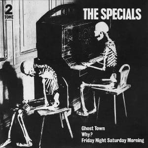
They had millions of photographs from the 50s to the 70s so a lot of the ideas we worked with used found bits and pieces. Ghost Town from 1981 is a good example of this – that was an old postcard that I found there. The doom-laden chords of the song really fitted the image.
There was a charming retro feel to many of your graphics of that era that reference those classic Blue Note sleeve designs by Reid Miles, but your own style evolved as the 80s progressed.
Yes, with Icehouse for instance in 1982 I got an opportunity to paint the cover for Hey Little Girl which was nice. It coincided with a shift in what was happening around me.
Spandau Ballet were a really big act on the label and David Band and Graham Smith were producing sleeves for them, I was influenced by that glamorous feel. The Icehouse material warranted something more contemporary – rather than the gritty 2 Tone style.
 The diversity of artists you worked with is immense. How was it collaborating with icons like Iggy Pop and Blondie?
Sadly I never got the chance to meet Iggy Pop but I did meet Debbie Harry and Chris Stein. We used a painting on the back sleeve for Iggy but I can’t remember who did it, possibly him or a friend of his.
Bands would often come in with a carrier bag with a painting that somebody had done and it was a question of trying to make something out of it!
For Blondie, we got to work on the single sleeves for Rapture, Atomic and several others. We worked on pop videos, too. They all went through the art department and, where possible, we would try to co-ordinate the look and feel of the videos with the covers and posters that we were producing.
We had a lot of artistic license with the Blondie sleeves but Debbie would come in and cast an eye over what we were doing. We didn’t get much direction there but we’d get a nod or shake of the head to give us a quiet steer.
Gloria Gaynor seems like an artist that wouldn’t necessarily sit comfortably with a lot of your clients at that time, but your sleeve for her exhibits some of your recognisable design DNA.
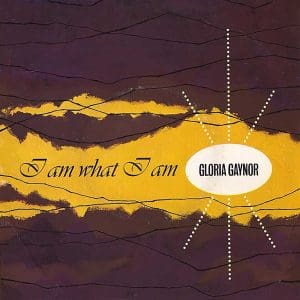
There are a lot of those early sleeves that send a shudder down my spine. I don’t like the cover art I created for I Am What I Am but loved the song itself.
By the time I had produced that cover, I had left Chrysalis to set up a design studio with friends but was still on a retainer for Chrysalis. They would give me mainly 2 Tone stuff along with other oddities like this.
It had to be produced in record time – we didn’t even have press shots and I was just asked to come up with something in a day!
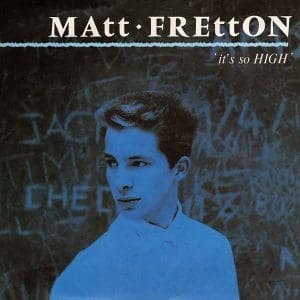 Chrysalis seemed like a label that took risks with its signings. Two very different young men came along in 1983 and the label clearly had big plans for both of them with some lovely design work, a lot of hope and plenty of hype.
The exciting thing about that time was that the label would invest money in their faith. Billy Idol is a good example – they really felt that they could make big stars. Another was Matt Fretton. He was a really nice guy with a lot of potential.
Matt was very interested in the graphics but sadly never broke through, despite the Smash Hits cover. For every Billy Idol there were a few Matt Frettons and you never knew who would make it. It’s such a fickle world.
I remember once when Billy came along to the art department, we had finished early and he had an hour to kill so we went to the pub and someone asked for his autograph. I asked if it annoyed him and he said it was more worrying when people didn’t ask. He was very level-headed. This was just before he broke the US and went massive.
There’s a political component to many of the sleeves that you designed, largely related to your work with Jerry Dammers.
After I left Chrysalis and was working on Tottenham Court Road, Jerry would come in almost every day.
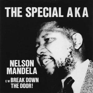
With the Free Nelson Mandela single, he just had a black and white photograph of Mandela so I worked on the typography with a layout, look and feel lifted from a Penrose design annual from my archive.
Jerry had a huge collection of old jazz albums and particularly liked the graphics on those old sound effects LPs, the covers were amazing and he went on to write a foreword for a book all about them.
He would often come in with half a dozen of these covers and we would use them as a starting point.
The Housemartins owe their brand identity to you. Your work for them stood out from the crowd at the time.
 I was initially approached by Go! Discs’ Andy MacDonald. He said he’d signed a new band that didn’t have any sort of visual image so could I listen to the white labels and come up with some proposals.
The only steer they had was that they loved the 2 Tone material so I knew we were looking at block type and big fonts, that kind of thing.
I revisited the Penrose design albums for inspiration and looked at various ideas that I felt would loosely fit the brief – that’s how they came together.
The Russell Boyce photograph on the cover of their debut single, Flag Day seemed like the perfect fit with that track and its ethos.
I think Paul Heaton provided that image but my main point of creative contact with the band was Stan Cullimore who I believe had been to art college. We had a very good working relationship and were able to nudge designs in a direction that everybody was happy with.
For the next single, Sheep, I remember trying to capture the character of the band because although their music had serious messages, they were not. I wanted to reflect that in the way the graphics looked.
That sleeve image is actually a collage of images I made up from the Barnaby’s Picture Library again. I rummaged through hundreds of boxes and collaged them together, quite creatively ambitious for 1985 – before computers were part of the design process.

For the big hit single, Happy Hour, the nature of the track to me suggested this whole idea of a corporation with these bored people who were looking forward to Friday night, going out on the lash and I wanted an image that reflected that.
Normally I would come up with three or four alternative ideas to show to the band but on this occasion I was so into it that I came up with about a dozen.
In the end, about six or seven were chosen and we used them for different things like picture discs, the single, the alternative single cover and another was used on the poster.
In the mid-80s record covers were all very colourful and glamorous with over-the-top promos, dripping with glitz, so in a way The Housemartins sleeves were a nice counterpoint to all that with their restrained colour palettes and unglamorous images.

For their debut album, London 0 Hull 4, it was the ultimate simplicity but funnily enough the ultimate simplicity takes a lot of work because every element has to be balanced for it to look acceptable.
By the late 80s, everything was shrinking down for CDs and I was losing impetus, running out of ideas.
I had an opportunity to move sideways into corporate design, working freelance for big London design agencies but my heart was never in it.
After taking time out to do a summer school at The Slade in 1996, I made the decision to return to my first love, fine art and I’ve been lucky enough to survive as a professional artist since then.
Post-Housemartins, your creative relationship with singer Paul Heaton brought you back to sleeve imagery of a distinctly different kind…
In 2014, I was able to combine my former life as a record sleeve designer with my fine art when one of my paintings was used on the sleeve of the Paul Heaton and Jacqui Abbott album What Have We Become.
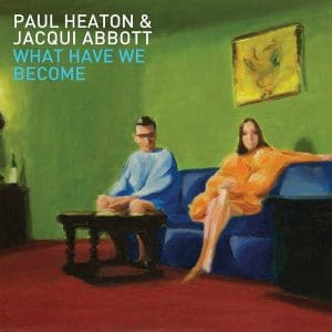 Paul had fallen in love with one of my paintings and they wanted it for the sleeve which he liked because it could be seen as them.
They have this warm rapport with their fans and when the album came out they ran a competition where their fans were asked to recreate the cover.
There were some wonderful entries including one that was made with marzipan and one made with LEGO. It was great to see people responding to my art in that way.
This sleeve then led on to me providing art a year later for their next album titled Wisdom, Laughter And Lines.
These sleeve images, like most of my paintings, are just random characters – I feel I’ve succeeded if people are able to project their own narrative onto my works, it brings them to life. It’s exciting to see my work on record sleeves again.
- Want more from Classic Pop magazine? Get a free digital issue when you sign up to our newsletter!