Pop Art – Rob O’Connor
By Classic Pop | February 19, 2023
 Rob O’Connor’s Stylorouge creative studio can arguably boast the largest pop portfolio of clients we’ve ever explored in Classic Pop magazine. From Meatloaf to Morrissey and Bowie to Barlow, we meet the man to talk four decades years of pop, design, music and mischief. By Andrew Dineley
Established by graphic designer Rob O’Connor in 1981, Stylorouge is notable for creating record sleeve designs for an eclectic mix of musicians including Blur, Siouxsie & The Banshees, Sandie Shaw, Squeeze, Adam Ant, Crowded House, Dr John and Simple Minds.
“After finishing art courses in Coventry and Brighton in the late-70s I began working for a small design agency in Brighton,” says Rob. “It was really unglamorous work but it was good discipline and I learned more about drawing, typography and layouts and got a good all round idea about commercial design.
“I knew I wanted to work on record sleeves and within a year of working at the agency, I was lucky to be offered a job with Polydor as one of their in-house designers… A lot of the bands were signed to Polydor so they seemed like a good fit for me.”
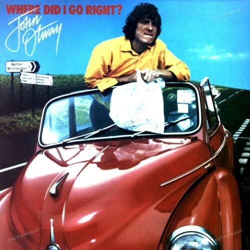
Your first cover design was for John Otway’s 1979 album Where Did I Go Right? You chronicle the humorous tale of its creation in your book Delicious: The Design and Art Direction of Stylorouge which was published to celebrate your first 30 years of design in the music industry. It really was a baptism of fire for you, wasn’t it?
Oh yes! When you’re in the art department of a record company you get to work on so much stuff and learn to bite your lip and get on with it. There was a lot of diversity, from Kirsty MacColl to Sham 69, and even advertising for James Last and John Travolta. I’m equally fascinated by the obscure artists, who after all the investment, hype and creative direction, still never managed to break through.
 French electro-balladeer Ronny is a great example – a darling of the New Romantic era who never lived up to her potential. I really enjoyed that era. She was championed by Rusty Egan. He and I got on very well, he liked what we were doing, we also redesigned the identity for The Camden Palace, the big nightclub he opened up with Steve Strange after Blitz Club.
It was an incredibly busy time and I realised I’d need to leave Polydor to set up my own studio if I was going to be able to accept larger projects with clients away from the label.
I created Stylorouge on my own but within six months the team had grown to four. I knew that there was the potential to grow the business, so the name Stylorouge was good as it wasn’t my name and it fitted in with the whole New Romantic French thing which was popular.
I almost asked Ronny to record our answerphone message for us! I like the mystery of it, a lot of people at that time were working under mysterious nom de plumes and it was vaguely political with its red reference.
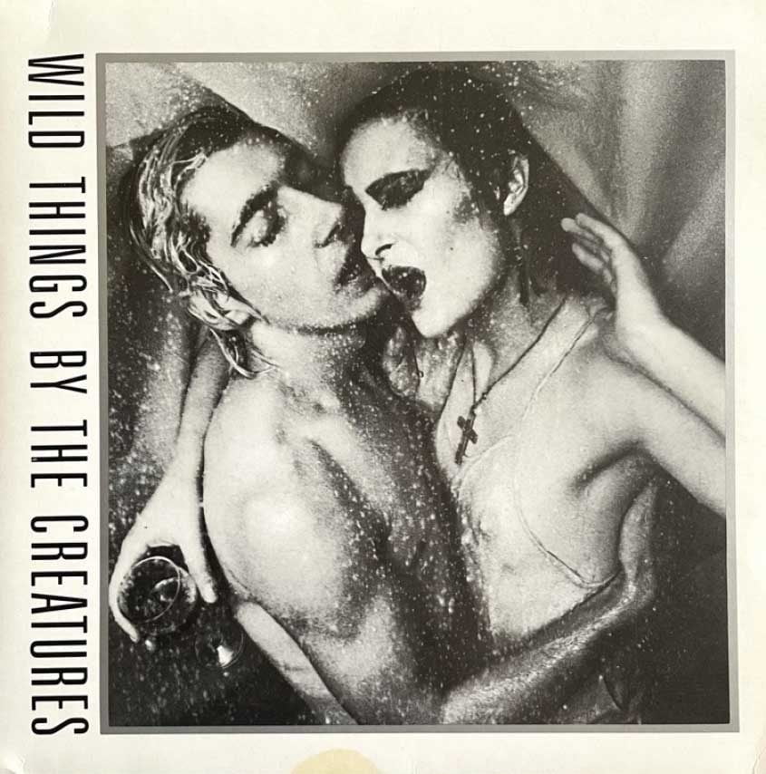
Initially we were based in a really small studio space which was mostly fine when working with The Creatures on things like their Wild Things EP as there was only Siouxsie and Budgie but it got silly when all four members of The Passions wanted to come in to talk about design. Then we would decamp to the pub, not very conducive really. Not long after that we moved to a bigger space.
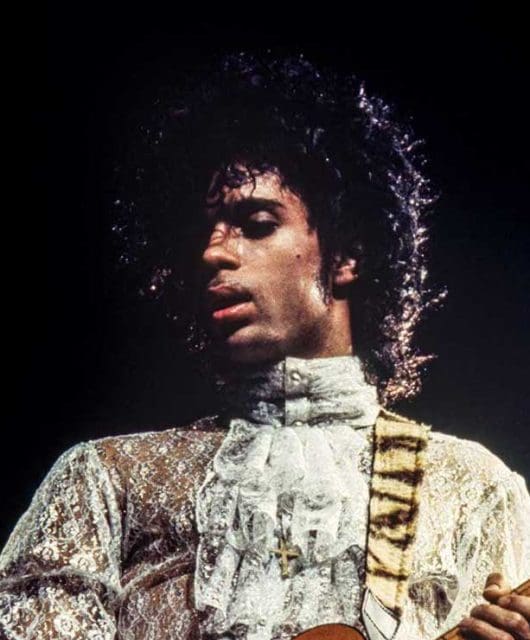
 Around that time you worked with George Michael for the first time, when he was with Wham! I understand it was also you that added that exclamation mark to their name. What’s the story behind that 1983 sleeve design for Bad Boys?
It’s such a simple cover but it took a long time, we did it three times. The first shoot was of George and Andrew escaping down an alleyway, looking like bad boys.
It was a bit like that opening scene in Trainspotting actually, which people may not know we also did the design for. We used those bad boy images of George and Andrew but they didn’t like them, so we did a reshoot with Eric Watson of them as leather boys.
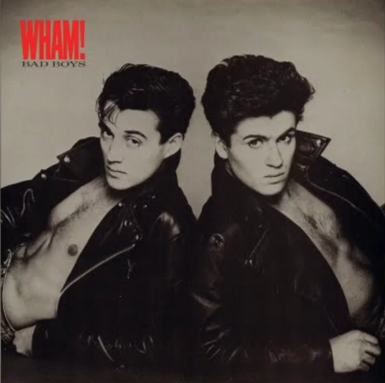
It looked good but Eric left the whole photoshoot in a taxi when he was bringing them over to me. All we had left were the clip tests and as much as we tried, it never really worked, so we used a shot from a third session with Chris Craymer and that was what became that iconic image of them leaning back to back.
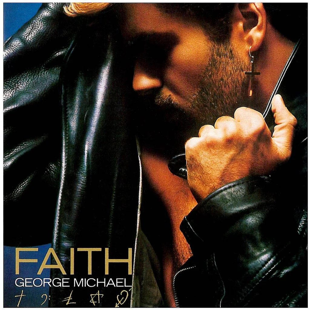
George was always really hands-on, when I worked with him later on with his first solo album Faith he would mark up the photographs to show what he wanted to be retouched up. We also designed dozens of different icons for the Faith sleeve, then he came in one day and said “I’ve been working on this myself and these are the five I like”.
For him they represented faith, music, money, fame and love, I think. He was also insistent that there should be no lettering on the cover but after the initial run Sony added his name and the title.
- Read more: Pop Art – Greg Jakobek
You also worked with Alison Moyet for quite a while, another artist known for being forthright. How was your working relationship with her?
We were there almost from the start with Alison, she’d had one single and she didn’t like the cover. She wanted something simpler, so we created a looser look with that hand-drawn logo.
I worked with the photographer Simon Fowler on the cover of the first album, Alf, we created the look of a barn in the studio with some old film props and we lit it with blue lights and smoke.
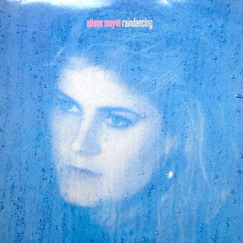
It looked great and we got lots of shots to use across the campaign. We did the follow up album, too, Raindancing and all the singles off it. Alison quickly tired of being a mainstream pop star and was already wanting to rebel against the major record company she’d signed to after leaving the indie label, Mute, with Yazoo.
She wanted to be really subversive and call the second album Watersports which was really funny and we even got as far as a midnight photo session with her, underwater at The Sanctuary Spa in Covent Garden.
Again, the record company wouldn’t give in, so we managed to get a less controversial wet reference in there with the eventual title, Raindancing.
Most designers at the time had a signature ‘house style’, an aesthetic that instantly distinguished their work. The only thematic style that runs through your work is the use of beautiful calligraphy and hand rendering…
I’ve always enjoyed calligraphy and still do it now given the chance. We were on a roll back then though. A lot of artists wanted their image to have some personality. They wanted to stand out from the mass produced, so using hand-lettering was a good way of achieving it.
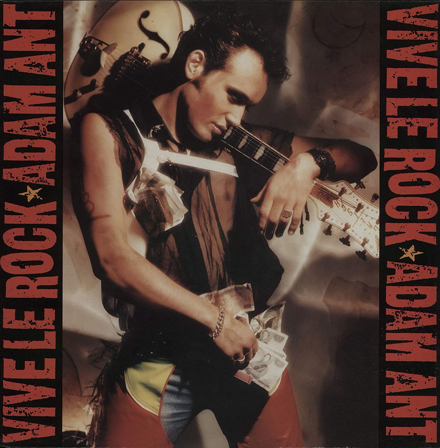
Another artist you began working with as a solo artist was Adam Ant. What was the creative relationship like with him?
He was extremely involved with everything. We worked with him around the time of the Vive Le Rock album in 1985. He was away on tour and he’d also taken on a theatre role, so he was quite distracted. He’s a real character and really respected that his art was in our hands.
He would send us postcards to see how things were going. He wore red PVC chaps on that Vive Le Rock cover that we got Nick Knight to shoot. It was a bit of a fashion and graphic reinvention for him really and a lot of fun.
- Read more: Pop Art – David Storey
Squeeze is a band that you’ve worked with for a long time, starting way back in 1985…
I still see them a lot. Their lyrics are often funny and tongue in cheek but visually it’s important to avoid making them look like a comedy band and that can be tough.
For their new album we’re working on something deliberately serious to reflect the darker themes of today that run through the tracks. They’ve been talking about art that is quite sombre and dark and I’m trying to pull them back a bit. It’s always an interesting negotiation.
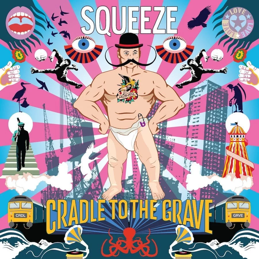
I really enjoyed working on their Cradle To The Grave album in 2015. It was based on a TV show by Danny Baker – a fascinating and funny observation of growing up in the 60s and 70s. The stories really coloured the design direction. We went for a slightly psychedelic look that referenced the work of Tadanori Yokoo whose work I love. Mark Higenbottam has worked with me for years here, and he did a great job on the imagery.
As the 80s was coming to a close you worked with Tears For Fears on their extravagant The Seeds of Love opus and its singles. How was that relationship?
This album infamously took the band four years to complete and it felt like the cover took almost as long! Roland Orzabal had it in his head that it would be his Sgt. Pepper’s moment, it was always going to be epic.
I can only take part of the credit because there were so many people involved. As well as Roland’s considerable direction, we had a photographer, set builders, stylists, so many people.
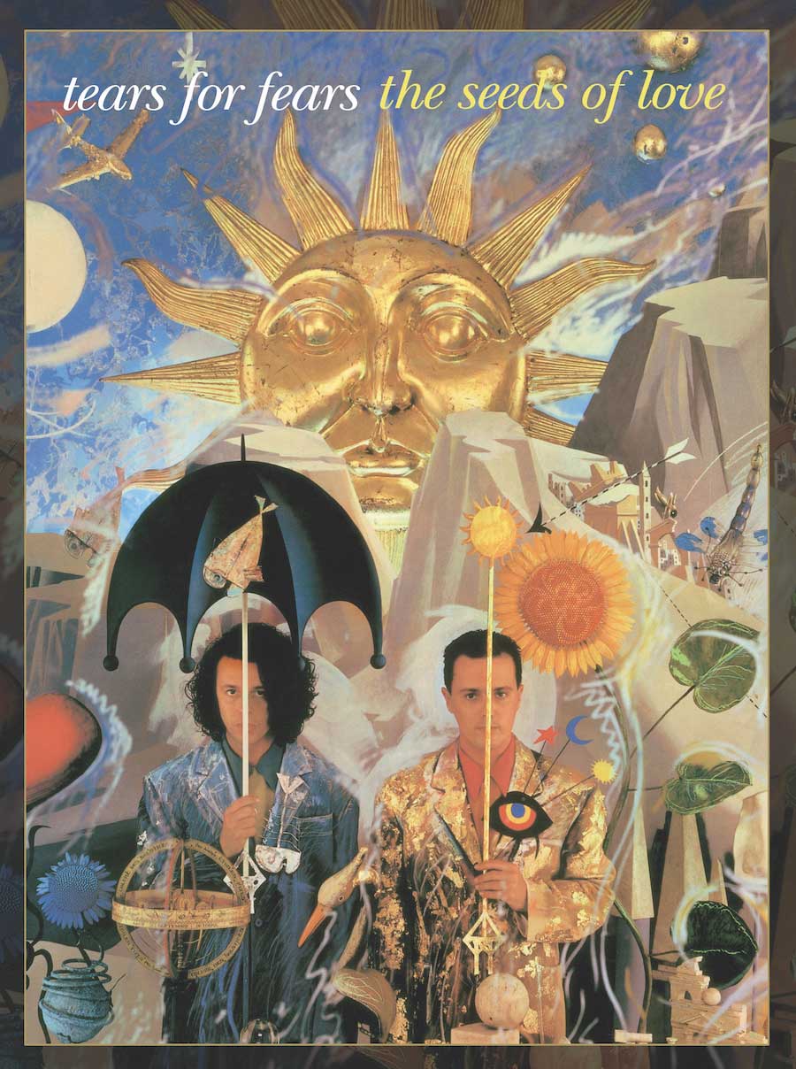
An ornate set was constructed that we visited for two weeks, shooting various people and props that were all used for the campaign and other singles. I still really love this, they were a great series of sleeves.
There was also a spin-off single by the band around that time, anonymously credited to Johnny Panic And The Bible Of Dreams, and we worked on the sleeve and video direction for that as well.
- Read more: Pop Art – John Warwicker
There really can be no other design studio in the country that can boast such a massive pop portfolio as Stylorouge. Inevitably we’ll have to leave out so much notable work, but we can’t overlook your design and art direction for Blur that began in 1990 with their logo and the first single She’s So High.
We had some of our most fun in meetings with Blur, the band were usually involved with the design but it was always Damon Albarn who called the shots. When we created that Blur logo, it was just before we started relying on computers so we worked on hundreds of variations, mostly by hand.
Blur were interesting because they didn’t really fit any style, so the design wasn’t supposed to either. They were sort of baggy, kind of pop and a little bit rock.
We tried to make them look like any other product than music, and to emphasise their Britishness, which we mostly succeeded with, but the first image we worked with was that famous Mel Ramos girl and hippo painting. From then on we did keep it kind of British, it was always all very cheeky and playful.
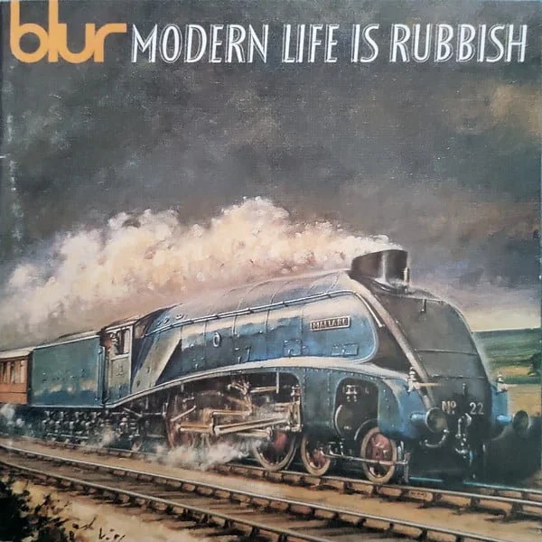
I think one of my favourite Blur sleeves is Modern Life Is Rubbish, the steam train kind of represented a downfall of standards in Britain. I came across a card in my newsagents and we obtained the rights to use it. It worked nicely with that 50s Festival of Britain typography.
It’s unlikely that anyone reading this won’t have your work in their music collection. Is it possible for you to pick a personal favourite?
The Banshees’ Juju album still stands out for me from 1981. I made something from nothing really. It was literally an African Juju mask, a ritualistic doll made from ebony that we used in negative so it looks gold. I wanted it to look like a 50s catalogue of artefacts but the band didn’t go for that. They did love the Dada nature of the cut-up music score I used as a collage though.
I think it’s still my favourite album of theirs, all the singles were great and I enjoyed designing them. However, it is very hard to pick a favourite though.
There are stories and experiences I’ll never forget behind almost every sleeve I’ve ever worked on.
- Want more from Classic Pop magazine? Get a free digital issue when you sign up to our newsletter!